
Telecom Mobile
Highlights
The Project
The Telecom Mobile project was born out of a “labs” app that was created to leverage existing dynamic network functionality that allowed users to view and control more of their network than ever before. Once the technology was proven, the business value of the app became readily apparent to all stakeholders, and it became necessary to make the app (and underlying architecture) customer ready.
I was already consulting on another project at the company, so I was asked to look at the existing app and suggest some changes. That exercise led to my full involvement in the project for 3+ years, seeing the app design through its first official release and many subsequent feature releases.
NOTE: This is a fictional representation of a project that I completed as a contractor. In accordance with NDAs and corporate policies, no client or company is named. All of the designs/deliverables shown here have been significantly altered to remove any connection to a specific company, brand and/or product.
My Role
I was brought into the project to take the labs app design that the development team had created, merge it with features from another app that allowed users to view service tickets and create a single, cohesive, cross-platform experience that was unlike anything released by the company before. There wasn’t a budget for user research and usability testing on the project, so a lot of the user research came from existing data and testing came in the form of the Agile “release early and release often” approach and learning from user feedback (which is highly effective).
Tools Used
Axure RP Pro 8, XMind Free, LibreOffice Draw, Inkscape, GIMP, Sketch/InVision, Affinity Designer, ColorMind.io
Duration
3 years from initial design through multiple officially released versions. Attended daily stand-up meetings and maintained the design throughout multiple releases. Worked within an Agile kanban environment to create designs for user stories that were to come in future sprints.
The Team
1 UX design contractor was tasked to assist me for the first 3 months of the project.
2 Mobile app developers working with the Ionic Framework tech stack.
1 QA engineer
1 Scrum master
1 Business analyst (with direction from managing senior staff)
Ongoing collaboration with corporate UX and marketing teams

User Research
“Create a modern, native mobile app that allows the user to monitor and act upon their network health at a glance with minimal interactions/clicks.”
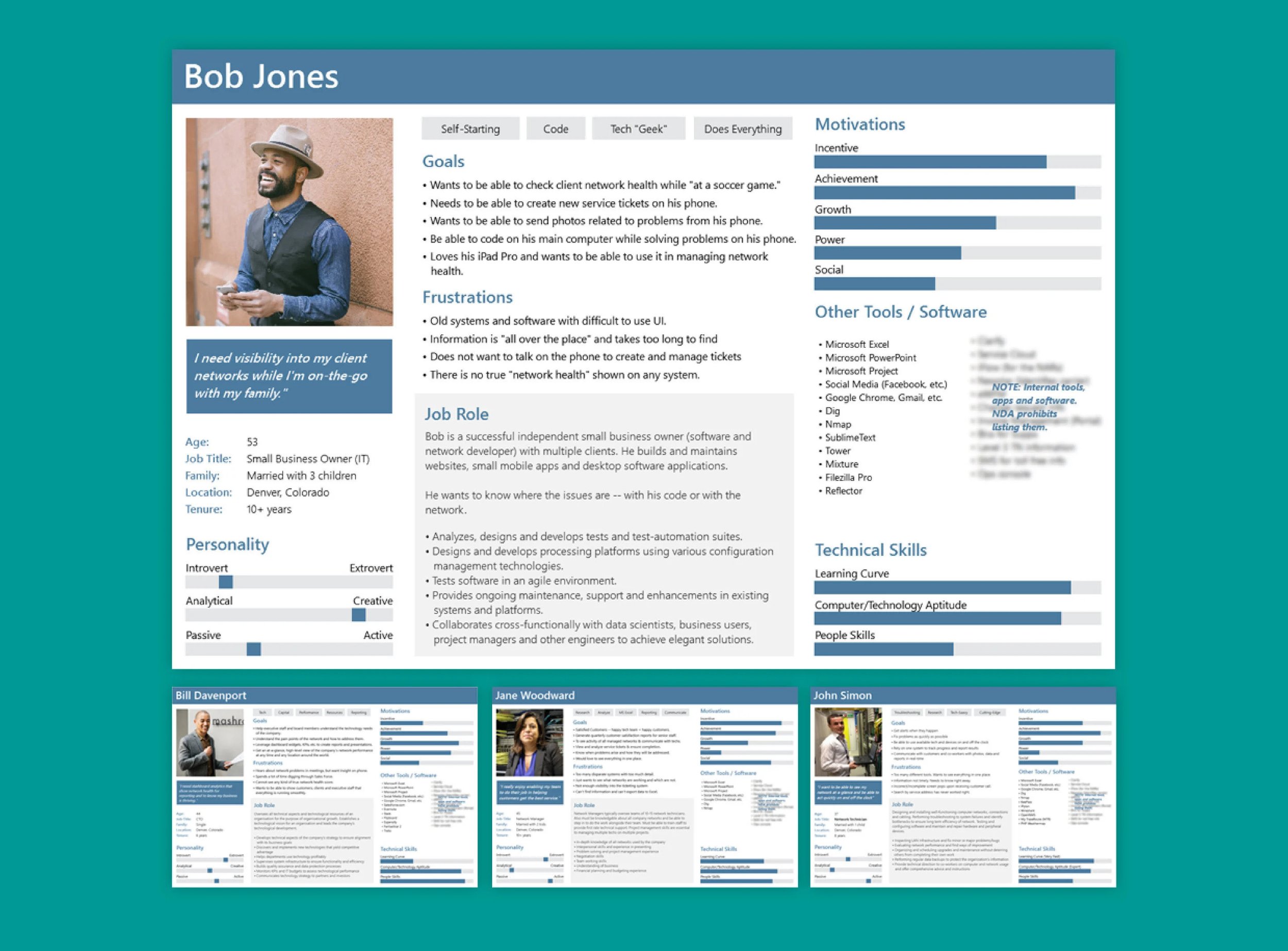
The project did not have the budget or time for extensive up-front user research. Since the ask was to blend the features and functionality of existing apps, there was an opportunity to leverage existing user research from these projects/initiatives. To facilitate the initial design process, I was able to put together relevant user personas based on existing user data and interviews with internal subject matter experts.

“Lesson: Leverage existing user research and documentation from other teams and other departments and learn how to interpret it to glean insight into user needs and goals.”
Information Architecture
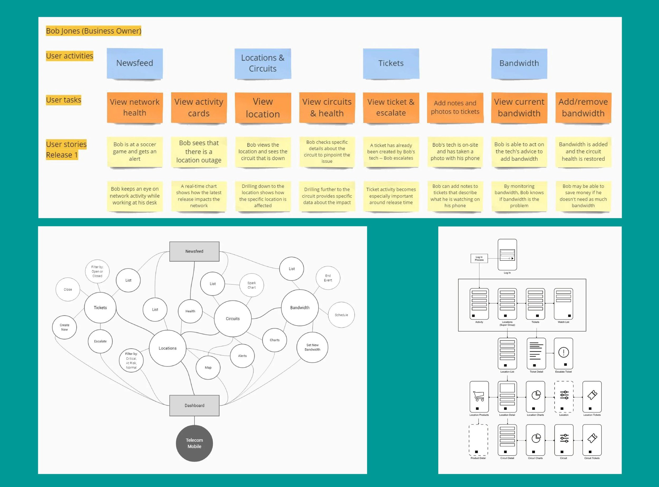
The project budget allowed for an additional UX designer for 3 months to help with the up-front research and design. Fortunately, I had worked with the contractor at a previous job, so we already had a compatible working style. Together, we were able to quickly work from the user personas into a task map. I used Pencil Project since it is free and cross-platform, this allowed the document to be shared and edited by other key stakeholders on the team.

The team went through a series of whiteboard discussions to talk about user goals, what users need to see and how all the major features and functionality in the backlog related to those goals. We all quickly began to see patterns arise. The concepts of a social media-like newsfeed and a heads-up-display-like dashboard both provided quick access to valuable information and features. As the app matured and new features were added, this map was used to ensure that the original user needs and goals were met.
“Open source software apps like LibreOffice, Pencil Project, Inkscape and GIMP are very useful for design projects where budgets are tight and the approval process is slow.”
User Scenarios & Story Mapping

I use scenarios and stories to provide a distinctly human context behind why a specific user or user group would use the software/app/website. I like to include the goals and "delighters" that were discovered during the early research phases of the project in the stories to keep the team focused on the users (personas). Story mapping is helpful in moving from research to design and can also be a key part of the Agile UCD process.
Wireframes

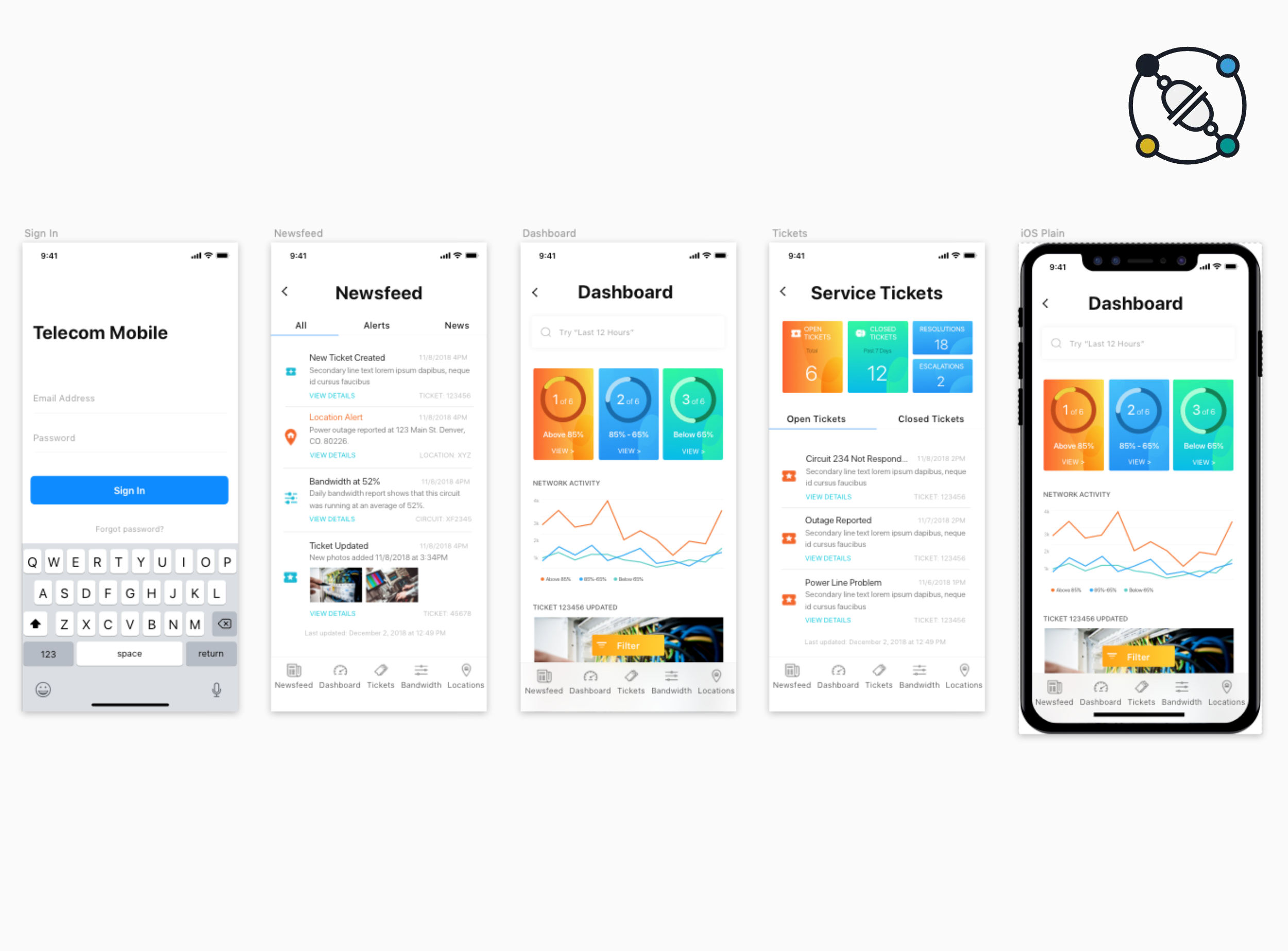
From the task map, I did multiple rounds of design on paper. Once the team settled on a solid design direction, the drawings were moved into a low-fidelity Sketch project. One small challenge did arise at this point: the other designer only worked on a Mac and his primary UX design tool was Sketch, but the client was mostly PC-based and used Axure RP. We found ways to work around the issue and, because I can comfortably work between platforms/tools, we made it work. I was also able to leverage Sketch later in the design process.

From Sketch on Mac to Affinity Designer and Axure RP on PC.
I evolved the task map into a site/feature map with the wireframes included for reference. The extended team found this document especially useful for visualizing the user goals that we had discussed together. I used LibreOffice Draw to create this diagram, again because it is open source and cross platform allowing for easy collaboration.

Prototyping
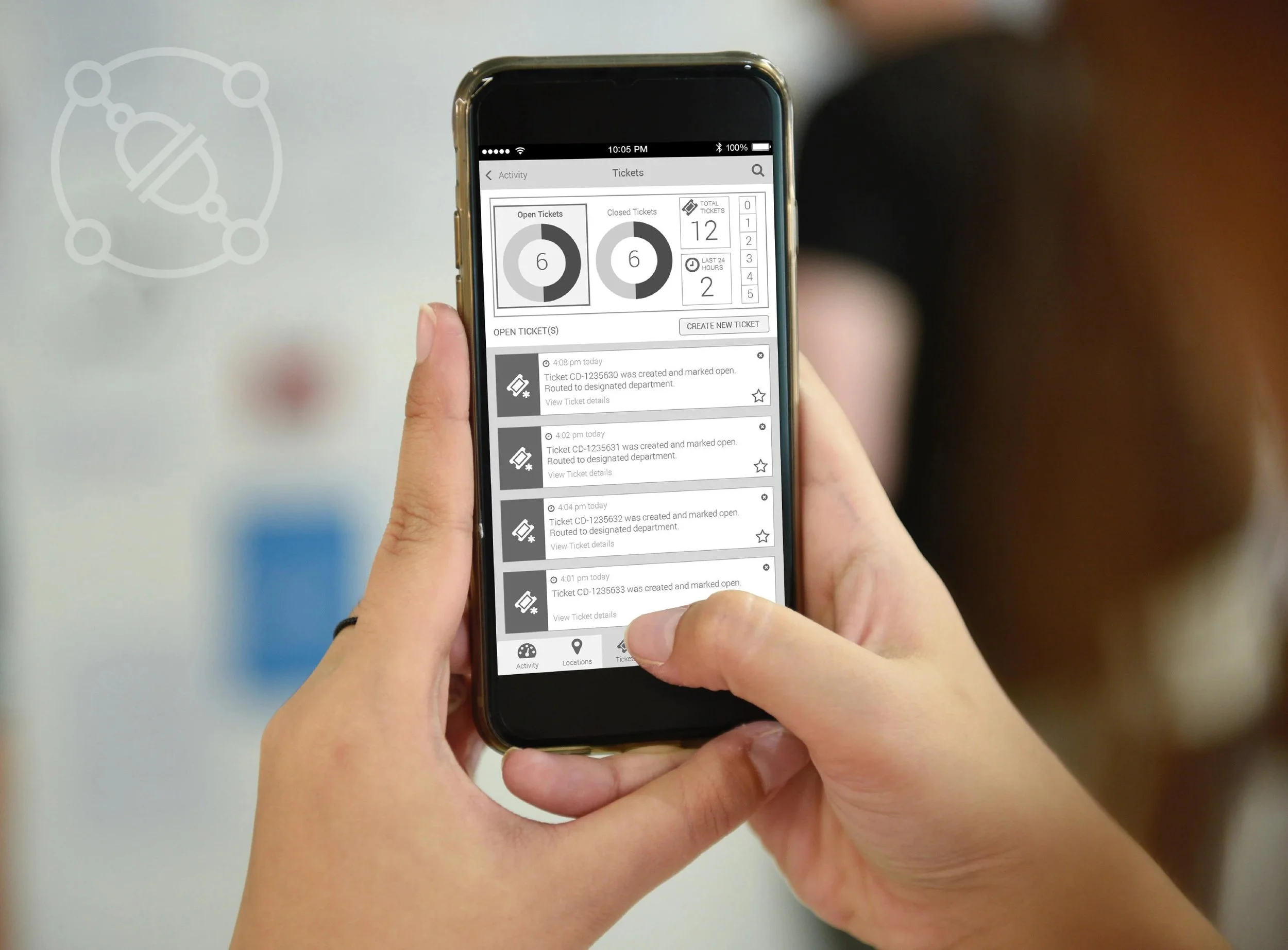
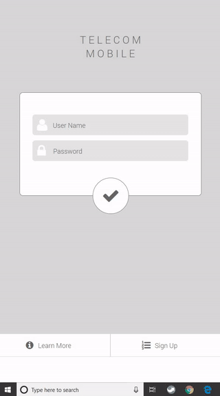
Once the team agreed on the direction of the initial low-fi wireframes design, I created a click-through prototype in Axure RP so that key stakeholders could “use” the app and we could do a quick round of in-house usability testing.
While the design tested well with internal users, proper usability testing would have been helpful at this point to solidify the design with input from actual customers. I put together a detailed usability test plan and script along with recommendations for conducting the test. But as often happens, the schedule and budget didn’t allow for formal testing, so we pressed on with the data that we had.
“Budget and schedules can sometimes be less than ideal for designers. The art lies in finding ways to do great work, regardless of project limitations.”
Native OS Moodboards
Moving into the design phase, I created some initial mood boards in Sketch based on the wireframe designs. As a starting point, I worked with concepts using Material Design and iOS standards.

iOS Moodboard

Material Design Moodboard
Competitive Analysis
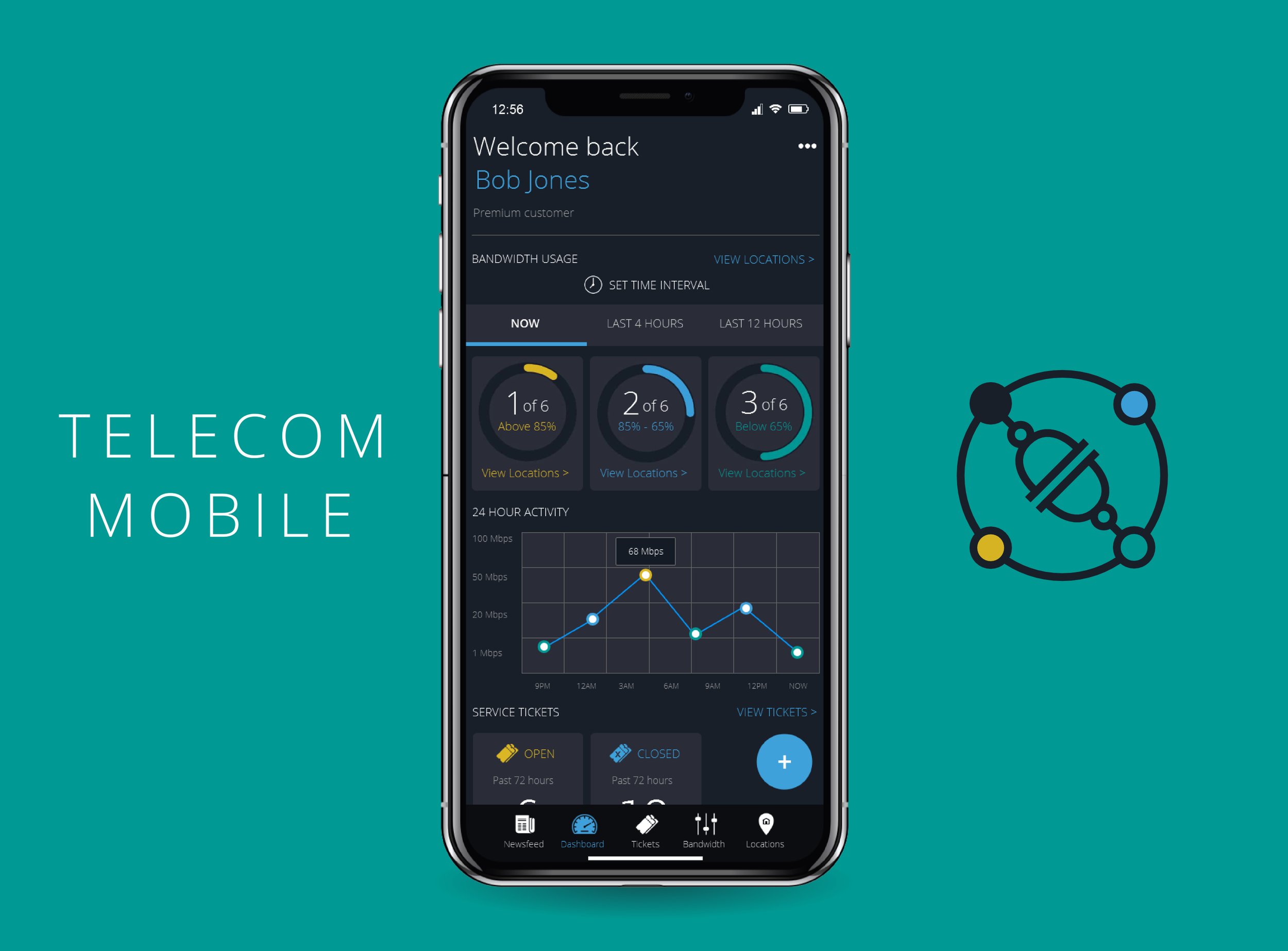
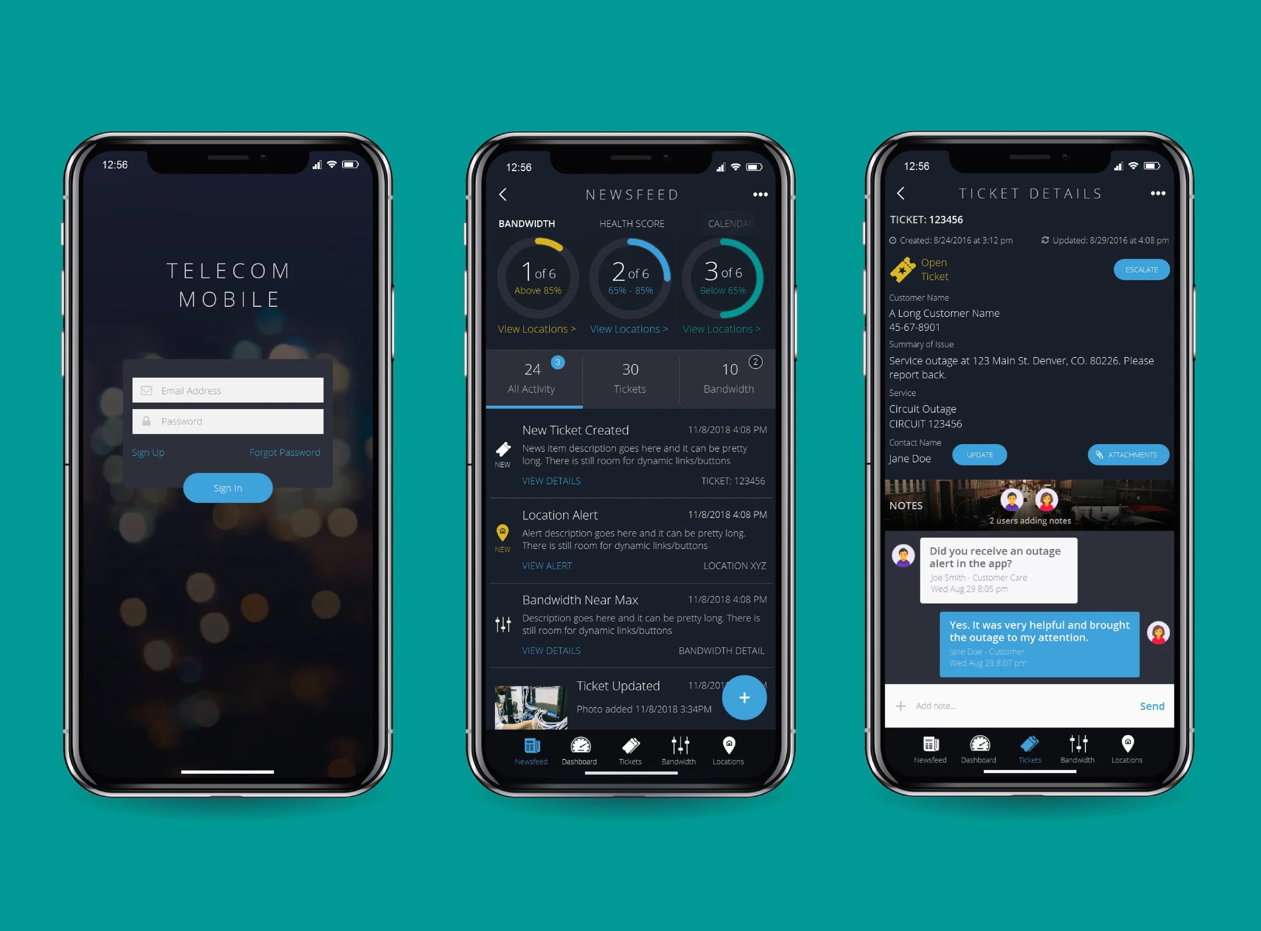
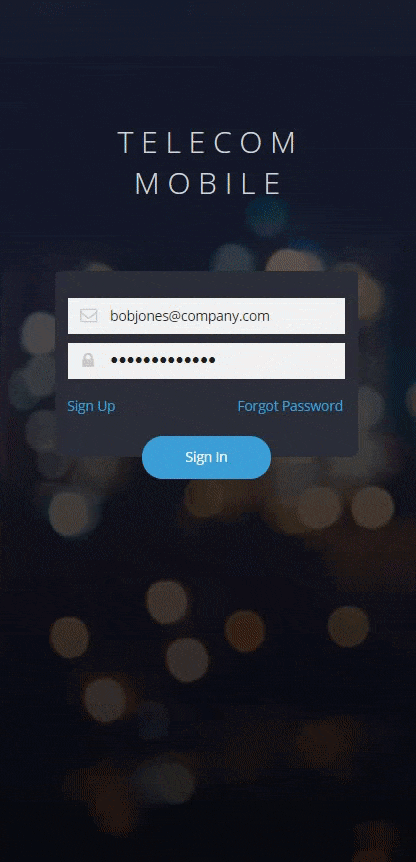
After the initial round of mood boards, the product owner wanted to move in a bolder design direction. At the same time, development made the decision that the app would be built using the cross-platform Ionic framework: one code base for any platform. The product owner was vocal about wanting the app to convey an image of “modern, high-tech, solid and dependable.” After multiple rounds of competitive analysis, I narrowed down what he was looking for – a dark (modern) color scheme with rich imagery. I was challenged to look beyond the company brand and existing products and make bold design decisions to make the app (and the team) really stand out. In addition, the approved tech stack (Ionic) dictated that the app would be cross-platform, so the design had to provide a common experience across platforms/devices.

The client responded positively to this “Dark Designed Apps” board on Pinterest.
Visual Design
The last rounds of design were done using what we called a “hybrid look-and-feel” - a single, OS independent design that could work on all mobile platforms. The dark theme was generally well-received, but the team also knew that it would be a difficult sell to get the design approved as a customer-facing application.

The final design was pushed even further toward a dark theme.

Project Outcomes
The Telecom Mobile app was successfully developed, released and is still available on the app stores today. In the end, the project was an excellent lesson in working as a UX designer at a large company.
Because the app is customer-facing, the design had to be approved by multiple teams, corporate marketing, and senior-level stakeholders. While the design shown here was very well received, the approval process moved the final design much closer to the corporate brand.
The version that exists today looks quite different and there were many compromises that had to be made to build the app. But that is the reality of designing software in the real world. I worked with the team for over 3 years on the project and we built a real product with real users that is helping the company succeed.
That’s what real software design is all about.
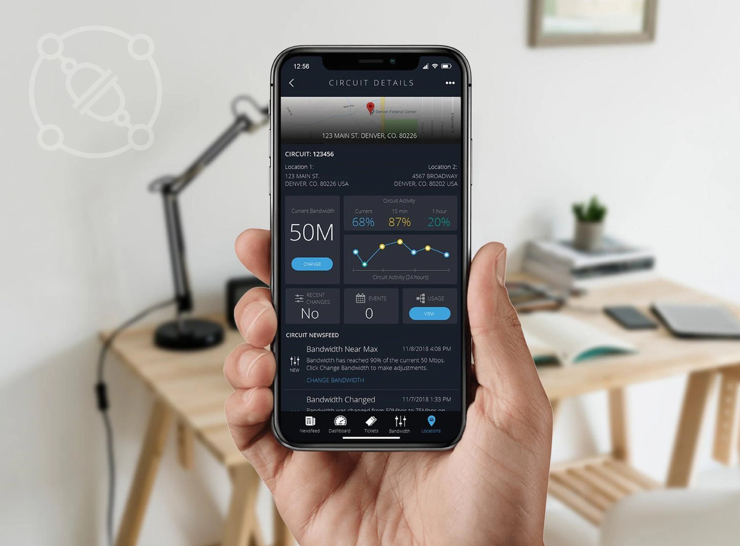
I built a working version of the full fidelity design in Axure RP Pro for demonstration and usability testing.