
Customer Insight 360 Web Application
Highlights


The Project
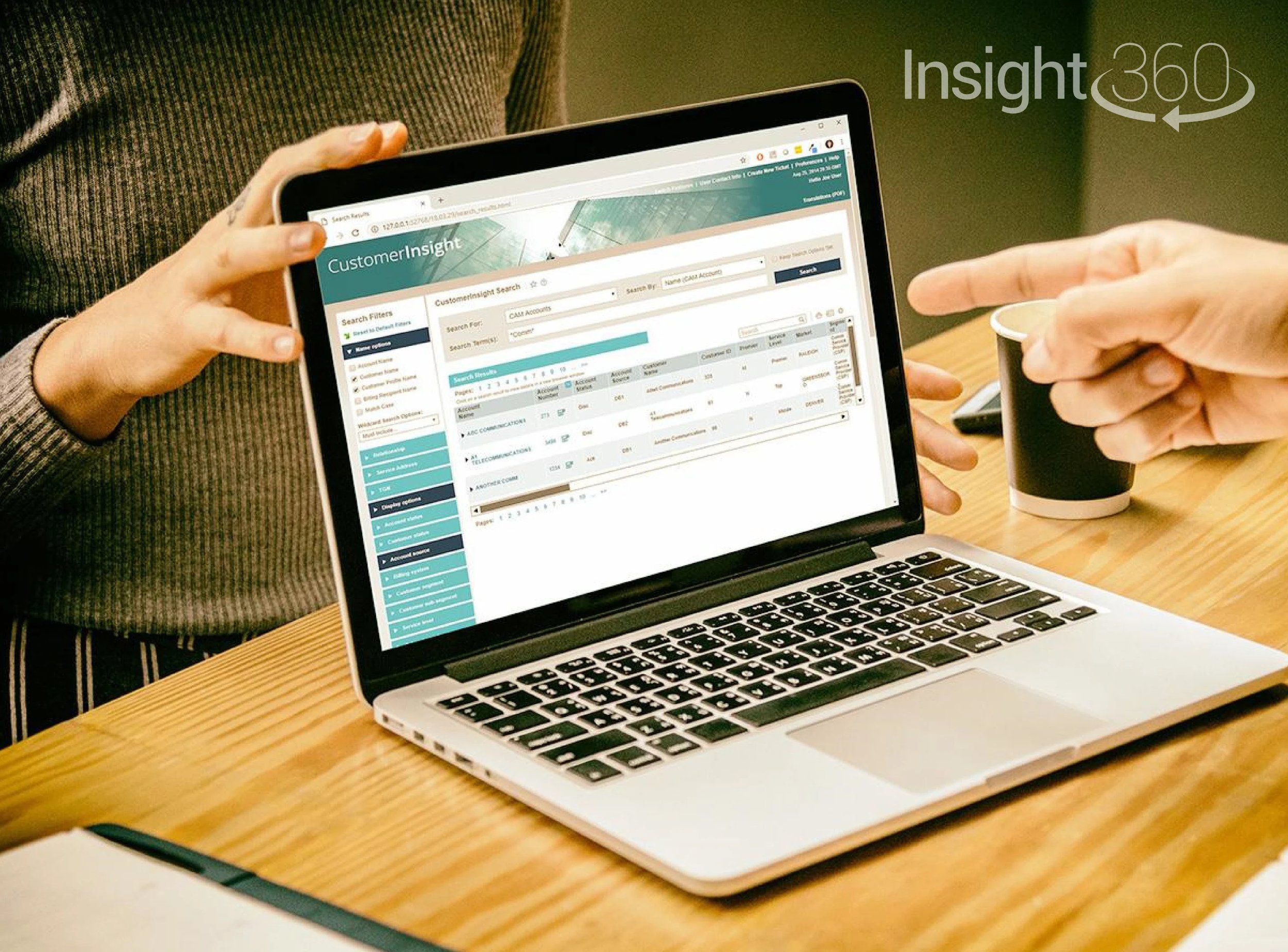
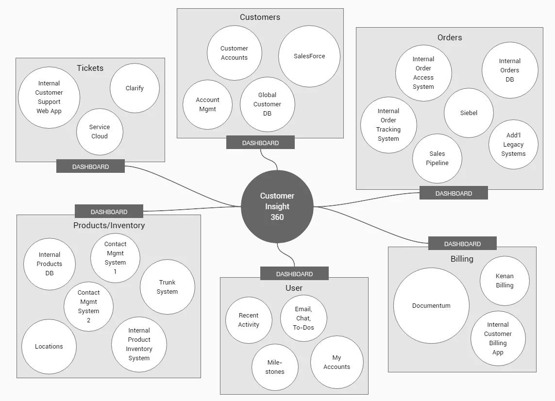
Customer Insight 360 is an in-house developed web application that provides visibility into customers and their data at various levels. Users of the web app can look across a group or hierarchy of customers, look at a specific customer, or look at a specific piece of customer information. Customer Insight 360 compliments other internal applications but does not replace them. It is intended to be used by anyone within the company who needs insight into customer information such as salespeople, sales support teams, customer service representatives (and their managers), field operations techs and the credit & collections teams.
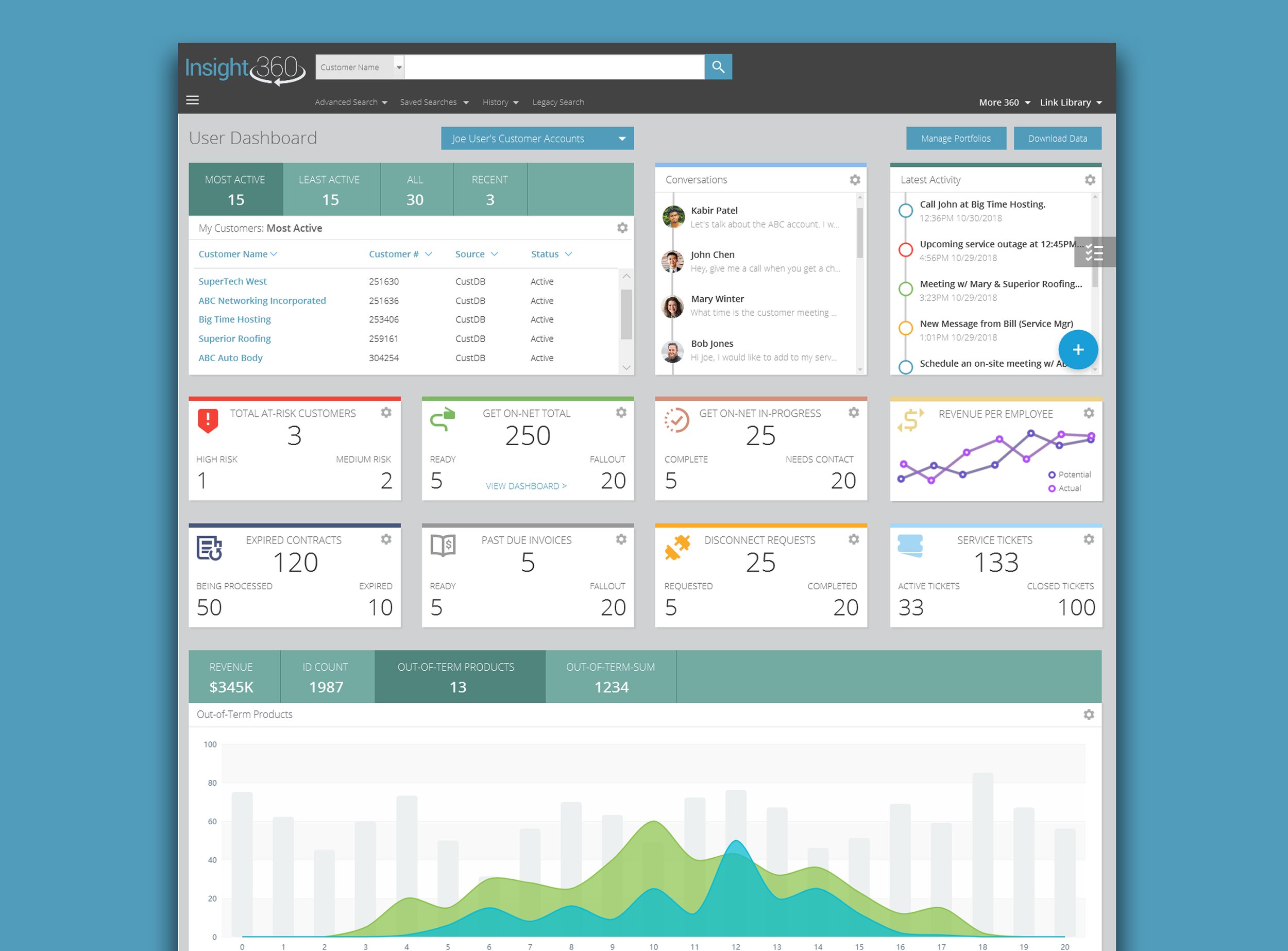
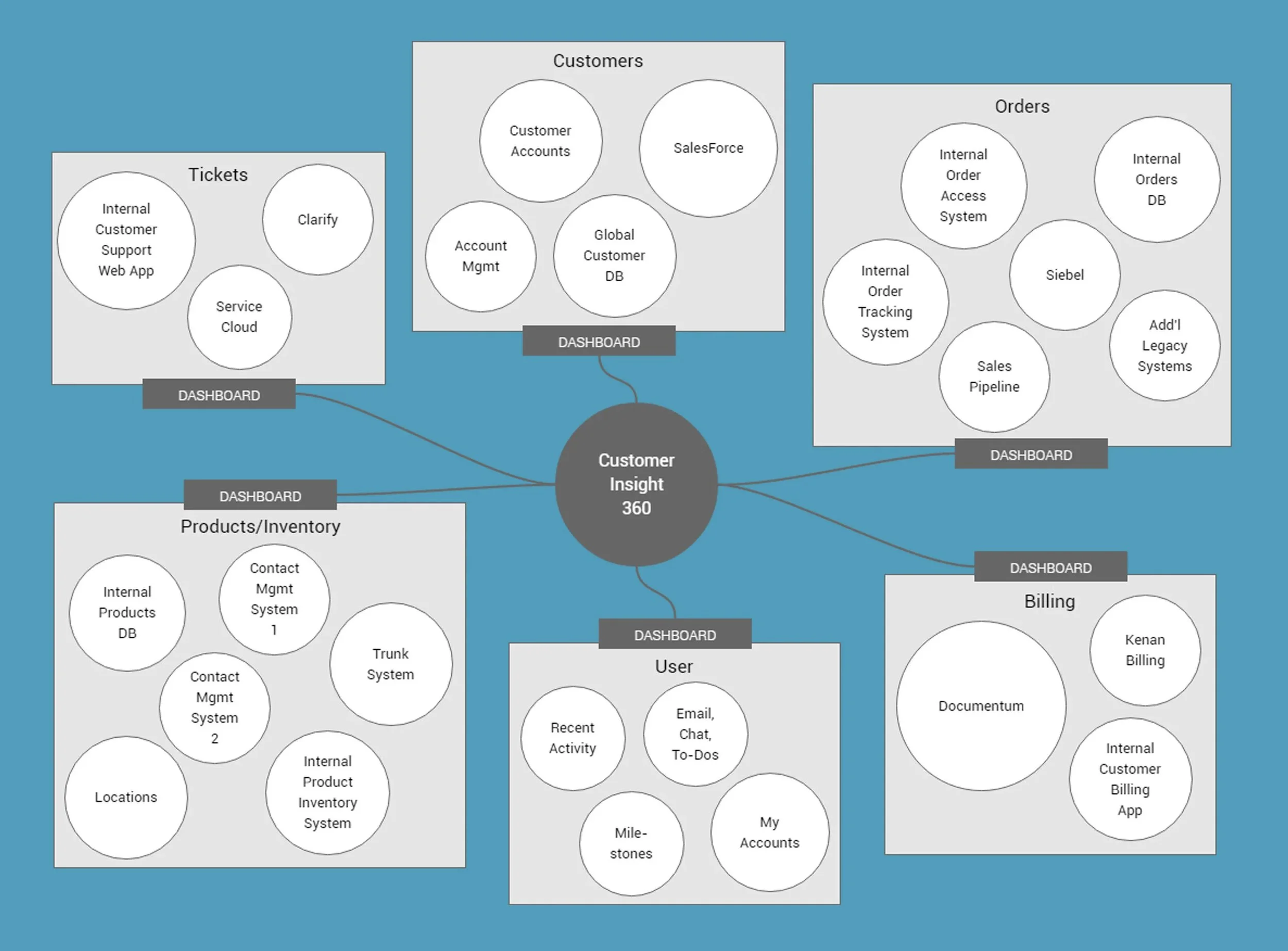
The web app is designed to be a “single pane of glass” to view information from source systems. It presents (but does not store) snapshots of key information from source systems, and for many users, it eliminates the need to access the actual source application. However, when additional detail is needed, there are always links to the source applications within the context of the item being viewed.
NOTE: This is a fictional representation of a project that I completed as a contractor. In accordance with NDAs and corporate policies, no client or company is named. All of the designs/deliverables shown here have been significantly altered to remove any connection to a specific company, brand and/or product.
My Role
I was brought on board to help redesign this large, complex, legacy customer information system. When I was hired, the app was 10+ years old and was a “house of cards” from a development standpoint: old tech stack, the UI layer was tied to the back-end systems, etc. There was a need to re-architect the system, but the changes had to happen over an extended period due to budget, resources and the end user base.
Being a good listener was a huge part of this project. The system had been in place and being actively used to help internal users do their jobs for many years. Even though the user experience was extremely complex (read: difficult to use), there was a strong resistance to change because changes to the system in the past had a direct impact on productivity.
Tools Used
Axure RP Pro 8, XMind Free, Pencil Project, Inkscape, GIMP, Affinity Designer, ColorMind.io

Duration
3 years from initial design through multiple official releases. Attended daily stand-up meetings and maintained the design throughout multiple releases. Worked within an Agile environment to create designs for user stories that were to come in future sprints.
The Team
4 - 6 developers working primarily with the Symantic UI tech stack
1 QA engineer
1 Scrum master
1 Business analyst (with direction from managing senior staff)
Ongoing collaboration with corporate UX and marketing teams

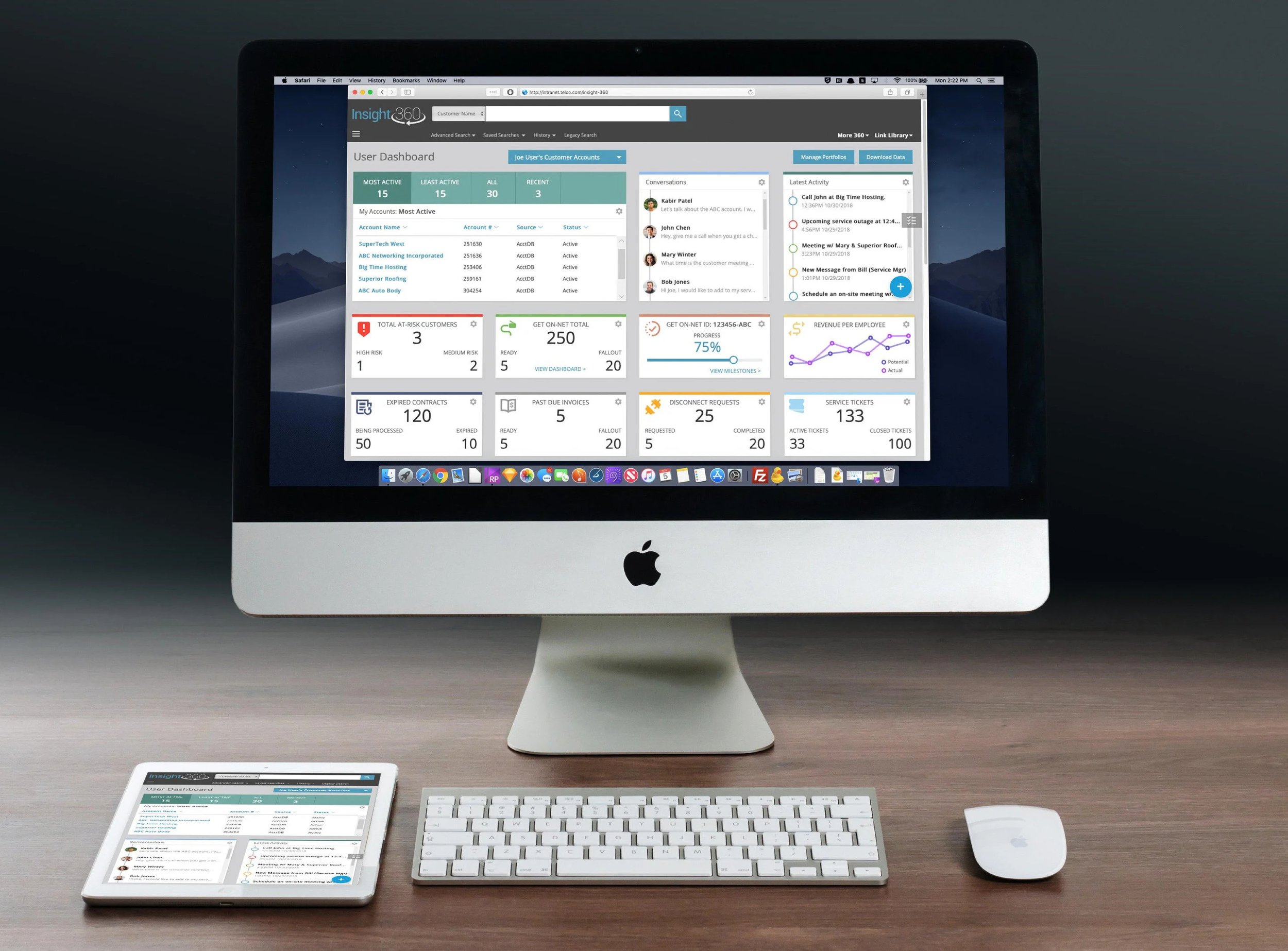
“Customer Insight 360 is a dynamic ‘pane of glass’ that presents interactive snapshots of key information from multiple source systems.”
The Problem
The original version of the Customer Insight web app was 10+ years old. The code was difficult to troubleshoot and maintain, there were multiple flavors of code (with no standardization), no consideration had been given to modularization, there was little to no documentation, etc. All these factors made it difficult to add new features and maintenance was expensive (an average of 14% of development hours over 15 sprints).
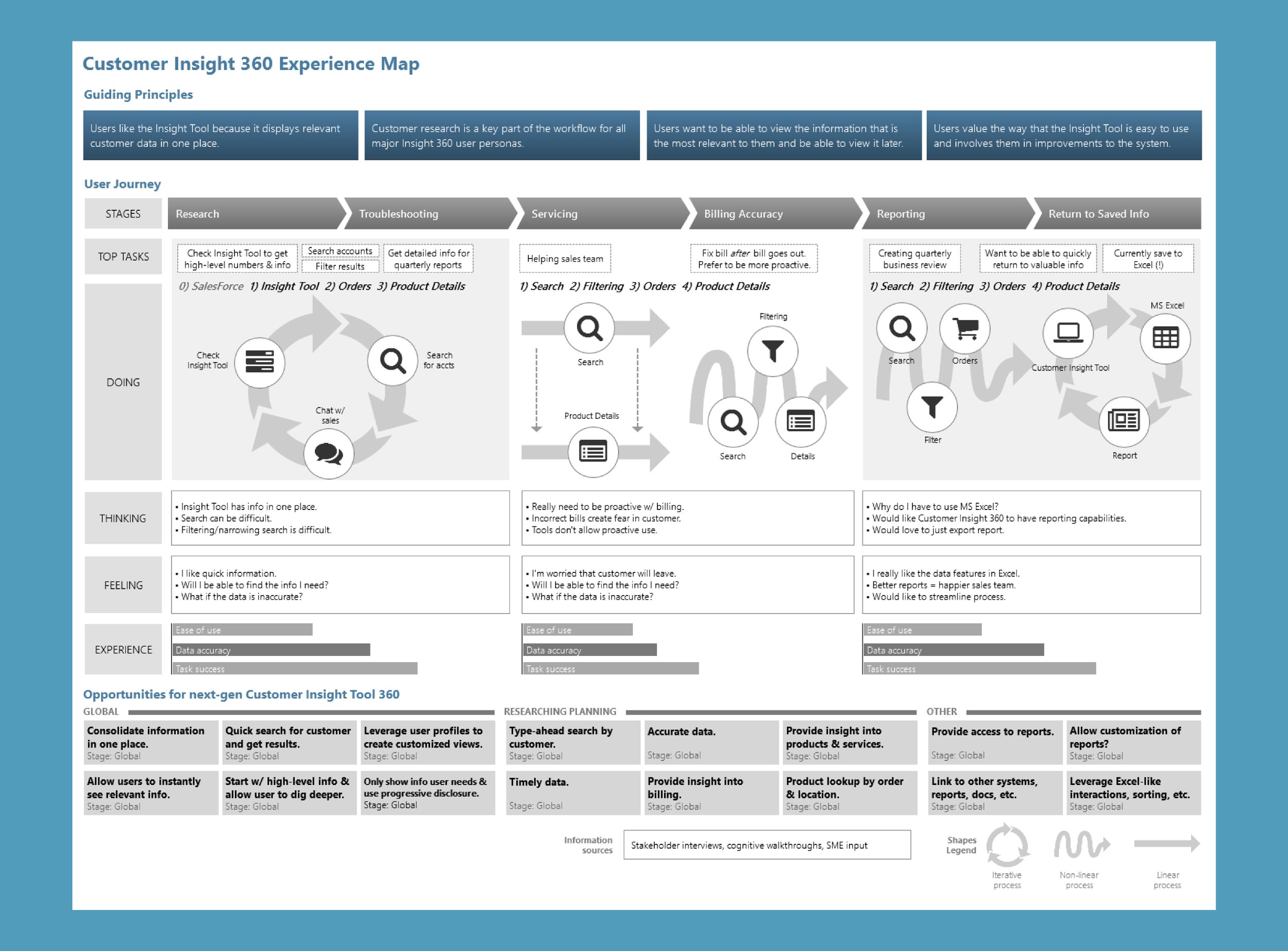
From a UX perspective, the app was made up of mostly data grid displays and user research showed that users wanted an interface that was information-driven. Almost every screen required previous knowledge and/or training and even then, the grid data would usually require analysis by the user. During user research, the recurring themes were, "You can't be proactive because the data is so spread out." "I want to get a snapshot of what is going on, all in one place." "I 'grew up' with the Insight Tool and love it, but am frustrated with what it has grown into."
The Solution
After extensive user research in the form of interviews, "shadowing" sessions watching real users work with the system and technical support data, the team found that users wanted the Insight Tool to be task-based (so they could get work done). Users wanted to be able to see a full view of the customer (a "360 view") and then, only when necessary, drill down into more detailed information.
User research data showed a need to see customer data in the form of graphical dashboards, interactive widgets, charts, and tables (particularly tables that could be exported to Excel). In the old system, many users would keep certain screens open in different browser tabs (!) to create a custom view for themselves and their customers. Overall, there was an immediate need for a system that required less training and allowed users to work more efficiently (less time to find information).
User Research
Primary audience: Customer support teams who help customers (often large enterprise/high value) with their accounts, data, networks, etc.
Secondary audience: Sales teams and any other internal teams that need to view, access and report on customer data.
Customer Insight Tool Usage Data
Total page hits = 3,086,046
Monthly average = 514,341
Daily average = 17,145
User Interviews and Shadowing Sessions

To kick off the Customer Insight 360 redesign, a series of interviews were conducted with fifteen active users of the existing system. I worked together with the product owner to produce a script that was designed to get the most information while avoiding common pitfalls associated with user interviews (“leading the witness,” users that want everything, etc.).
The team had been making consistent improvements to the existing system at this point and we learned that the users were very resistant to change. As a result, the interviews were particularly important in building trust with the user base – we were going to work together to redesign the system to meet their needs and goals.
The user interviews were conducted via Skype and were helpful. But many of us on the team felt that we needed to see the users work at their desk. We called it “a day in the life” or “shadowing” sessions.
The shadowing sessions provided the most important data of the user research phase. I worked together with the product owner and the lead developer. We sat with real users, observed their typical workday and asked questions along the way.
We discovered that many users kept their own customized “dashboard” in Excel. They had links directly to the customer accounts that they work on, a “to-do” list and links to recent activity.

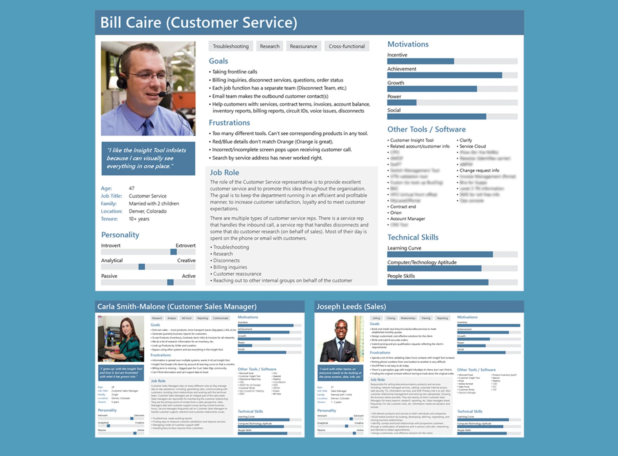
User Personas

Journey Map

Task Map
“I have a hard time finding the information that I need because I often don’t have the right search criteria.”

“I want to see all relevant customer data in one, centralized place.”
User Needs Analysis

To get approval and funding for the project, it was important to illustrate the benefits of the re-design upward to senior staff. This user needs analysis matrix was extremely useful for communicating the benefits and prioritizing features.
Low Fidelity Wireframes
Pencil Project came in handy on this project as well. Because it’s free, most of the team had it running on their machines so we could share files.
I like to keep design as collaborative as possible – allowing everyone to contribute design ideas gives a sense of ownership and pride in the final design.
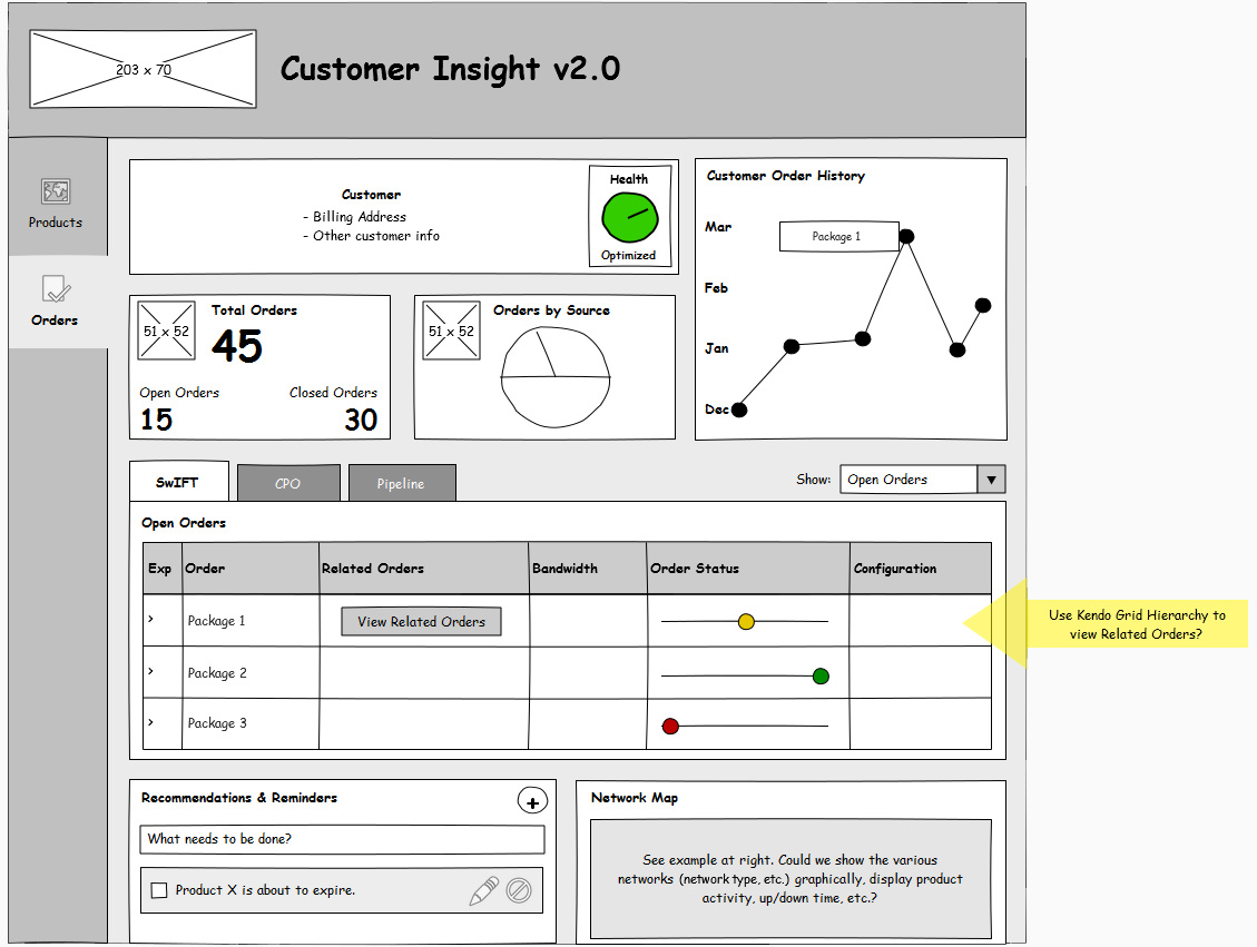
Wireframes


Visual Design


Project Outcomes
Customer Insight 360 is currently deployed and in-use at the company. The new system was developed in parallel while the old system was still running. Users were able to use the new system and provide feedback while retaining their existing workflows in the old system.
As expected, the newly designed workflows and features proved extremely successful with users and there have been usage increases and efficiency gains across the board.
Because the system is a non-customer facing app, features and functionality were usually prioritized higher than UI design. As a result, the system that is currently in place is in the same spirit as my Axure designs, but it is far from “pixel perfect.” An interesting lesson in Agile development!

I built a working prototype in Axure for use in executive presentations, rapid usability testing, working with key stakeholders and to demonstrate features to development.