TELECOM MOBILE CASE STUDY

Cross-Platform Mobile Telecom Network Health at a Glance

The Project

The Telecom Mobile project was born out of a “labs” app that was created to leverage existing dynamic network functionality that allowed users to view and control more of their network than ever before. Once the technology was proven, the business value of the app became readily apparent to all stakeholders, and it became necessary to make the app (and underlying architecture) customer ready.

I was already consulting on another project at the company, so I was asked to look at the existing app and suggest some changes. That exercise led to my full involvement in the project for 3+ years, seeing the app design through its first official release and many subsequent feature releases.

I was brought into the project to take the labs app design that the development team had created, merge it with features from another app that allowed users to view service tickets and create a single, cohesive, cross-platform experience that was unlike anything released by the company before. There wasn’t a budget for user research and usability testing on the project, so a lot of the user research came from existing data and testing came in the form of the Agile “release early and release often” approach and learning from user feedback (which is highly effective).

Project mission statement:

“Create a modern, native mobile app that allows the user to monitor and act upon their network health at a glance with minimal interactions/clicks.”

User Research

The project did not have the budget or time for extensive up-front user research. Since the ask was to blend the features and functionality of existing apps, there was an opportunity to leverage existing user research from these projects/initiatives. To facilitate the initial design process, I was able to put together relevant user personas based on existing user data and interviews with internal subject matter experts.

LESSON

Lesson: Leverage existing user research and documentation from other teams and other departments and learn how to interpret it to glean insight into user needs and goals.

The project budget allowed for an additional UX designer for 3 months to help with the up-front research and design. Fortunately, I had worked with the contractor at a previous job, so we already had a compatible working style. Together, we were able to quickly work from the user personas into a task map. I used Pencil Project since it is free and cross-platform, this allowed the document to be shared and edited by other key stakeholders on the team.

SKILLS USED

Telecom Mobile project skills shown. Final Telecom Mobile design.

Budgets Are Often Tight

“Open source software apps like LibreOffice, Pencil Project, Inkscape and GIMP are very useful for design projects where budgets are tight and the approval process is slow.”

Telecom Mobile task map

Task map created using Pencil Project helped to visually simplify a TON of complexity.


Paper prototyping

User Scenarios & Story Mapping

I use scenarios and stories to provide a distinctly human context behind why a specific user or user group would use the software/app/website. I like to include the goals and "delighters" that were discovered during the early research phases of the project in the stories to keep the team focused on the users (personas). Story mapping is helpful in moving from research to design and can also be a key part of the Agile UCD process.

Telecom Mobile scenario map

User stories mapped into a journey across network health, circuits, tickets, and bandwidth — aligning user activities, tasks, and stories for Release 1.

Wireframes

From the task map, I did multiple rounds of design on paper. Once the team settled on a solid design direction, the drawings were moved into a low-fidelity Sketch project. One small challenge did arise at this point: the other designer only worked on a Mac and his primary UX design tool was Sketch, but the client was mostly PC-based and used Axure RP. We found ways to work around the issue and, because I can comfortably work between platforms/tools, we made it work. I was also able to leverage Sketch later in the design process.

I evolved the task map into a site/feature map with the wireframes included for reference. The extended team found this document especially useful for visualizing the user goals that we had discussed together. I used LibreOffice Draw to create this diagram, again because it is open source and cross platform allowing for easy collaboration.

Telecom Mobile wireframes
Telecom Mobile experience map

Prototyping

Once the team agreed on the direction of the initial low-fi wireframes design, I created a click-through prototype in Axure RP so that key stakeholders could “use” the app and we could do a quick round of in-house usability testing.

While the design tested well with internal users, proper usability testing would have been helpful at this point to solidify the design with input from actual customers. I put together a detailed usability test plan and script along with recommendations for conducting the test. But as often happens, the schedule and budget didn’t allow for formal testing, so we pressed on with the data that we had.

Despite the lack of formal usability testing, the prototype still proved invaluable as a communication tool. It helped bridge the gap between design and development, allowing engineers to visualize intended interactions and product managers to validate workflows against business requirements. By simulating end-to-end tasks, the prototype reduced ambiguity, uncovered a few friction points early, and gave the broader team confidence to move forward. Even in a constrained timeline, it served as a shared artifact that kept everyone aligned on what we were building and why.

Telecom Mobile interactive wireframes

Find Ways to Work Around Limitations

“Budget and schedules can sometimes be less than ideal for designers. The art lies in finding ways to do great work, regardless of project limitations.”

Competitive Analysis

In 2016, the competitive landscape for mobile apps in the telecom space was surprisingly thin, especially for large-scale network monitoring. Most Tier 1 telecom providers were still relying on desktop portals and legacy dashboards, leaving their mobile offerings limited to basic account management, billing, and customer support. True dynamic network monitoring—real-time visibility into circuits, bandwidth utilization, and incident tracking—was rarely extended to a mobile experience. Instead, IT managers and business owners were expected to log into complex web portals from their laptops, which often lacked responsiveness and created friction for on-the-go decision making.

A few early movers, such as AT&T and Verizon, were experimenting with network visualization features in their enterprise apps, but these tended to be shallow extensions of web tools rather than purpose-built mobile solutions. None of them provided a cohesive, real-time workflow that combined health monitoring, ticketing, and bandwidth management in one place. This gap highlighted an opportunity: by delivering a mobile-first experience tailored for business owners, the Telecom Mobile app could leapfrog competitors. The goal was to create an interface that wasn’t just a scaled-down version of a portal, but a dedicated tool that gave users actionable insights into their networks from anywhere, at any time.


Telecom Mobile competitive analysis


Telecom Mobile competitive analysis
Telecom Mobile wireframes


Telecom Mobile hybrid app design

Moodboards

Moving into the design phase, I created some initial mood boards. First for vibe and then for design direction in Sketch based on the wireframe designs. Moodboards are a powerful tool in UX design because they help define the emotional tone, visual language, and overall aesthetic direction of a product before committing to full-scale design. They allow stakeholders to quickly align on look-and-feel—color palettes, typography, iconography, and layout conventions—without getting lost in functionality details.

During this stage, the senior leader of the project challenged us to move beyond the standard playbook. Instead of following the company’s official design system, he pushed for a darker, high-tech aesthetic that would differentiate the app from other projects in the company. This directive gave the team permission to take creative risks, and experiment with deep color palettes, bold contrasts, and a sleeker visual tone more commonly found in consumer technology than in B2B telecom tools. While it meant stepping outside of the brand’s comfort zone, it opened up new possibilities for creating an interface that felt modern, confident, and purpose-built for power users.

Visual Design

The last rounds of design were done using what we called a “hybrid look-and-feel” - a single, OS independent design that could work on all mobile platforms. The dark theme was generally well-received, but the team also knew that it would be a difficult sell to get the design approved as a customer-facing application.

In reality, the design remained more of a bold experiment than a finalized system. The dark, high-tech aesthetic gave the app a distinctive personality and made complex network data feel modern and powerful on mobile, but it was never fully reconciled with the company’s official design standards. The team knew this direction carried risk, and while it generated excitement internally, we also recognized that any customer-facing release would likely require significant rework to align with the brand’s visual identity.

Telecom Mobile final mockup
Telecom Mobile scenario map

The PM pushed the final mockups even further toward a dark theme.

Project Outcomes

The Telecom Mobile app was successfully developed, released and is still available on the app stores today. In the end, the project was an excellent lesson in working as a UX designer at a large company.

Because the app is customer-facing, the design had to be approved by multiple teams, corporate marketing, and senior-level stakeholders. While the design shown here was very well received, the approval process moved the final design much closer to the corporate brand.

The version that was released looked quite different from what is shown here, and there were many compromises that had to be made to build the app. But that is the reality of designing software in the real world. I worked with the team for over 3 years on the project and we built a real product with real users that is helped the company succeed.

That’s what real software design is all about.

Telecom Mobile experience map

AI-FIRST UPSKILLING

Prompt, Build, Refine: Leveling-Up with AI

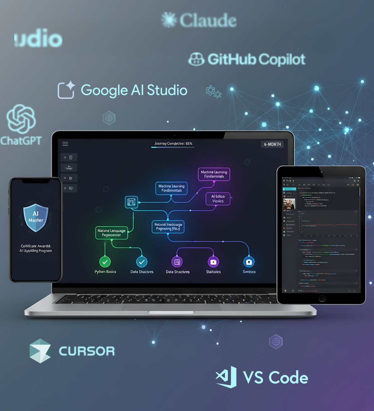
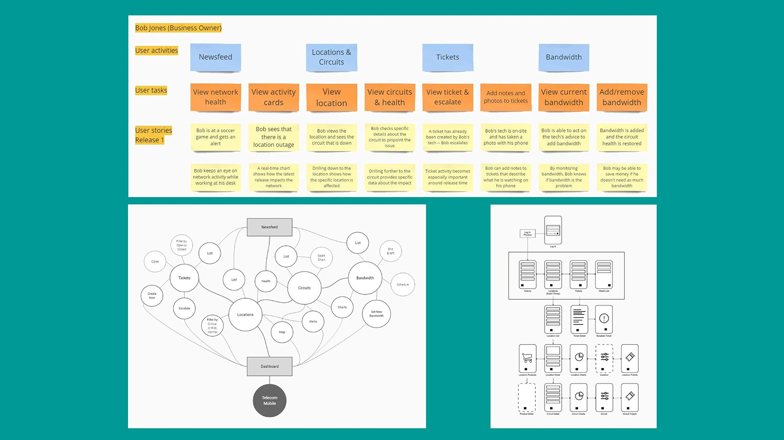
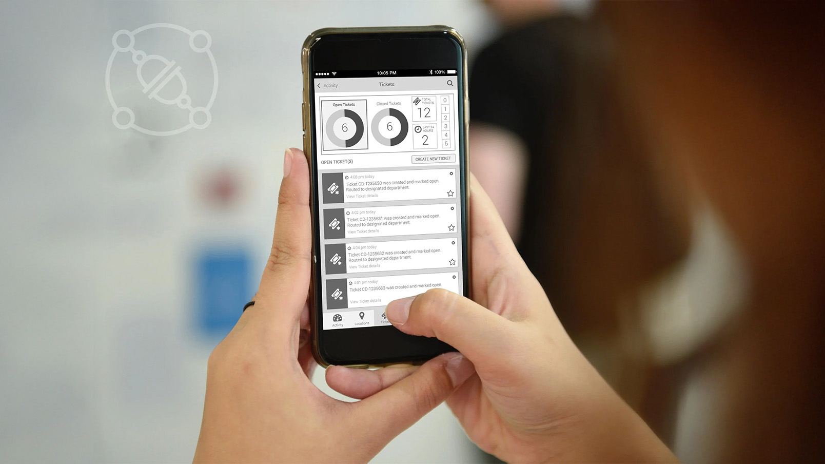
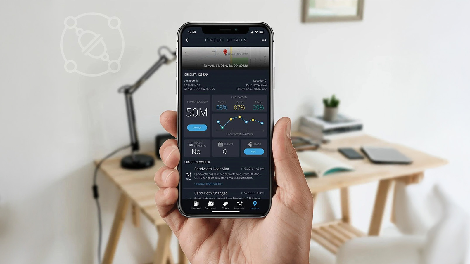
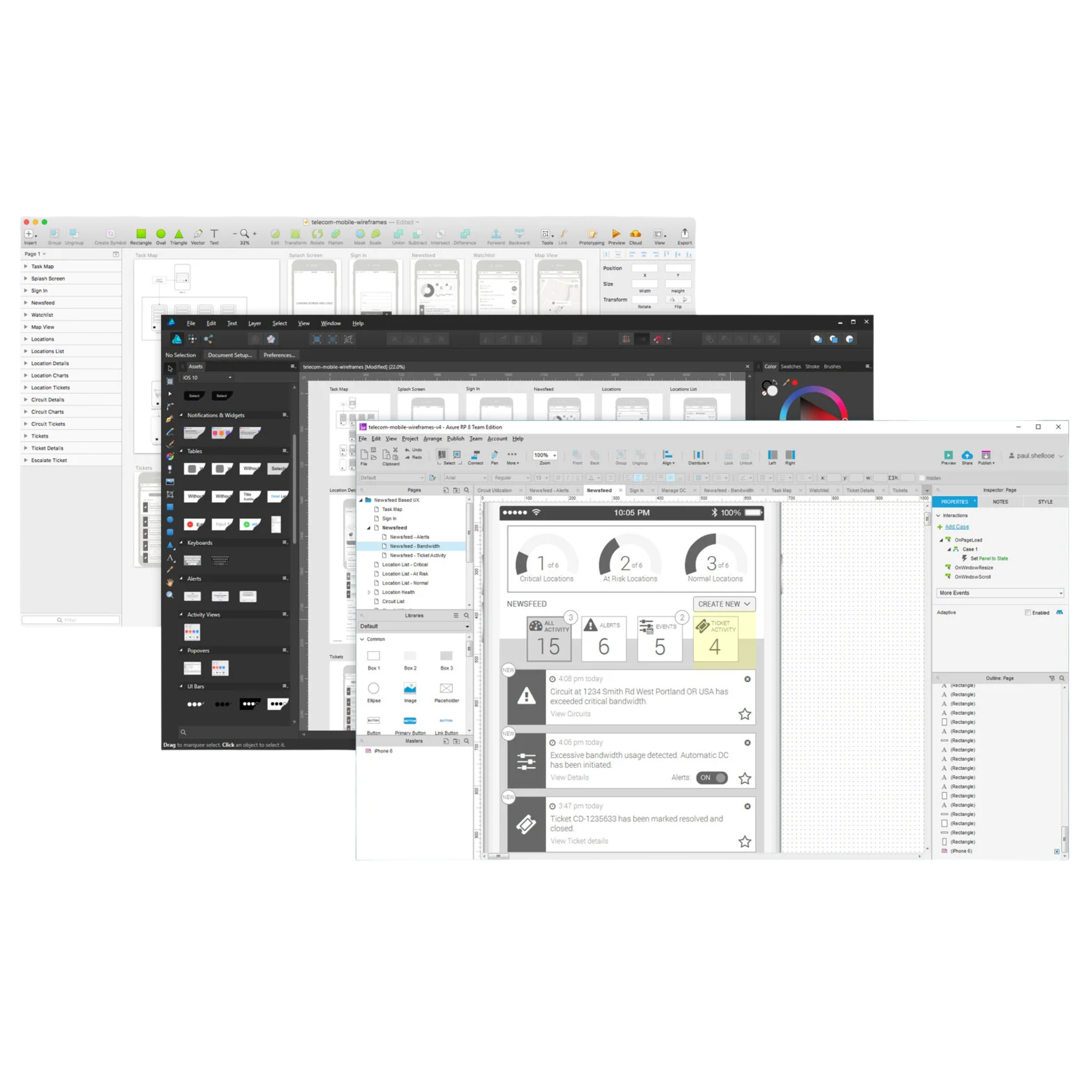
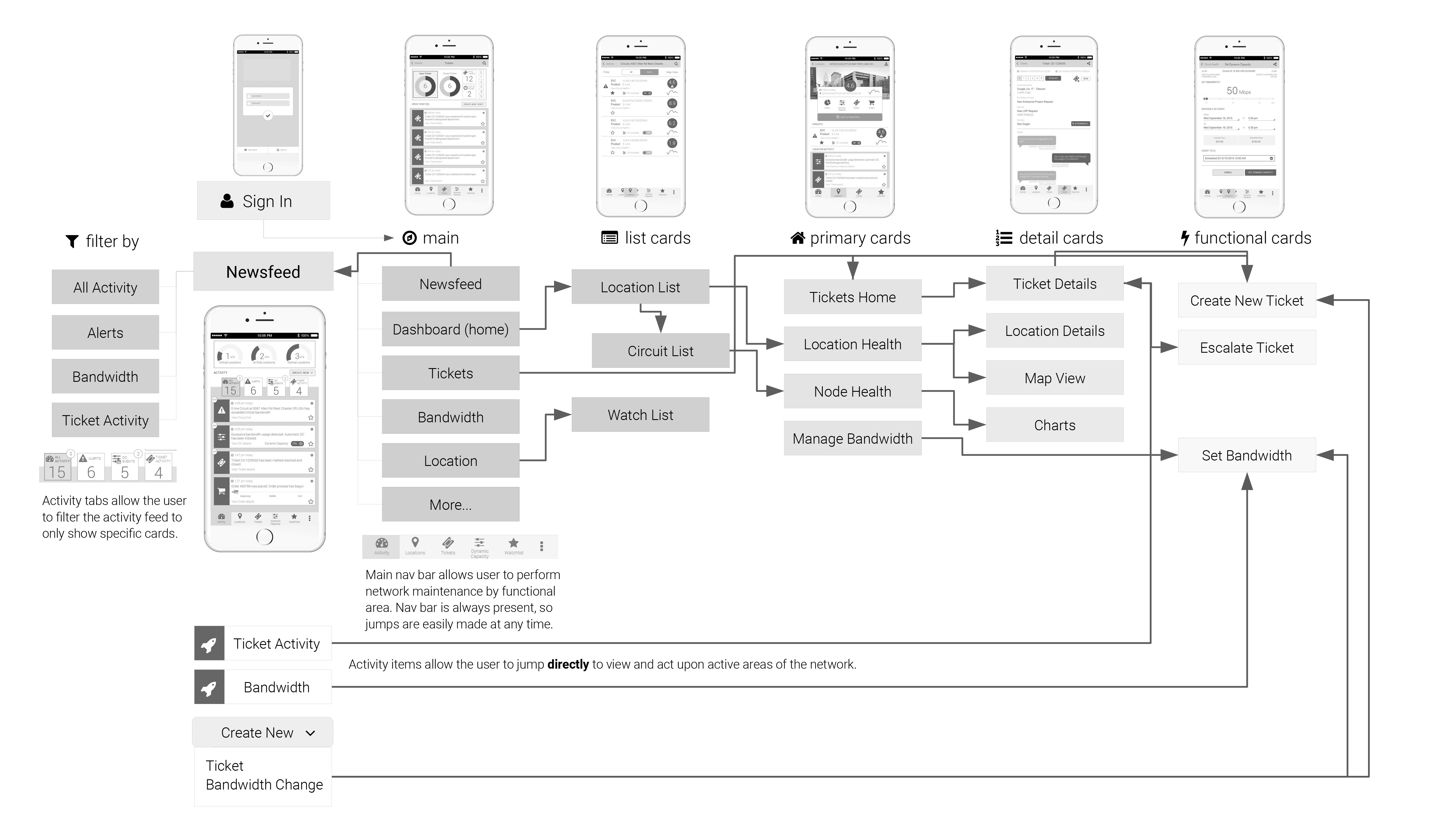
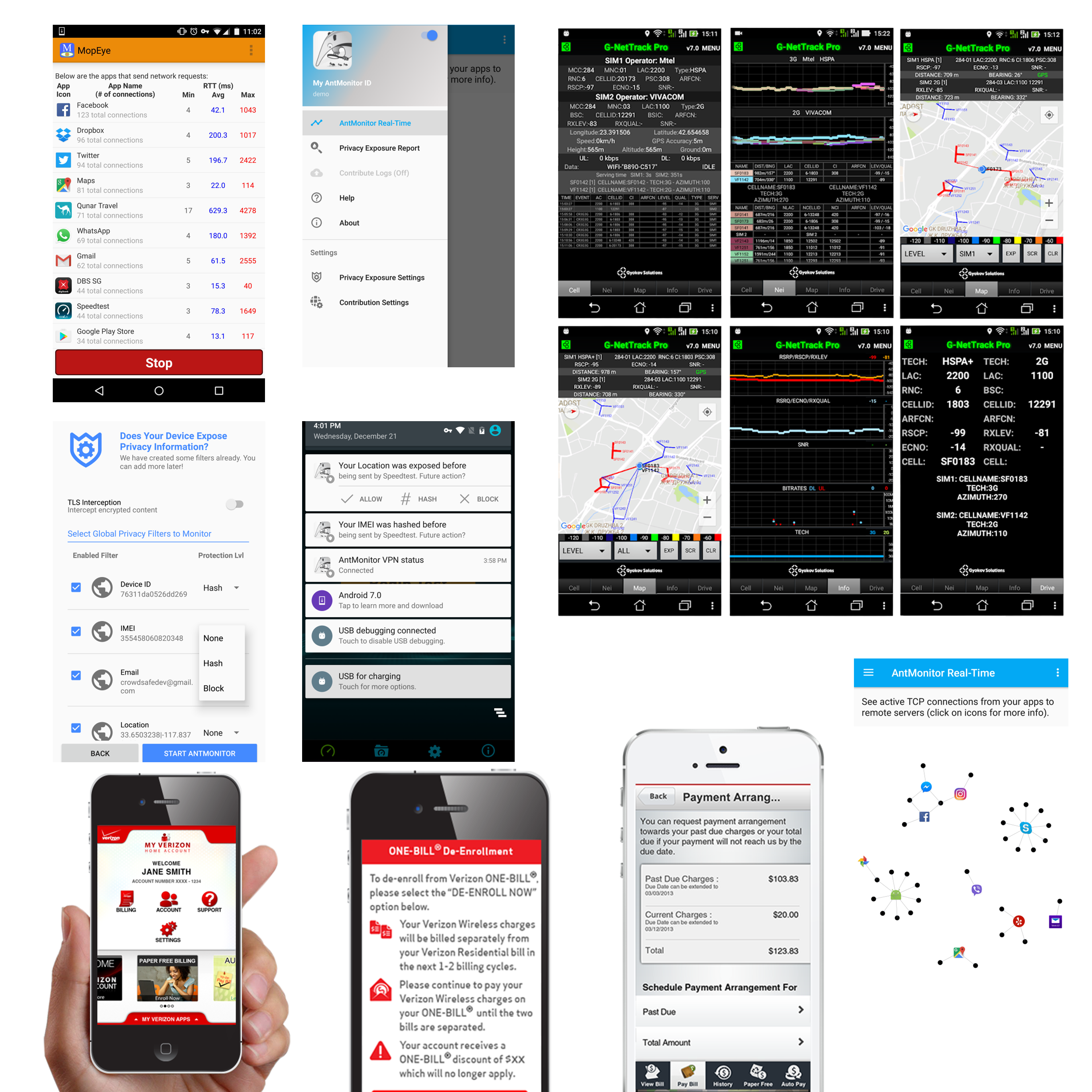
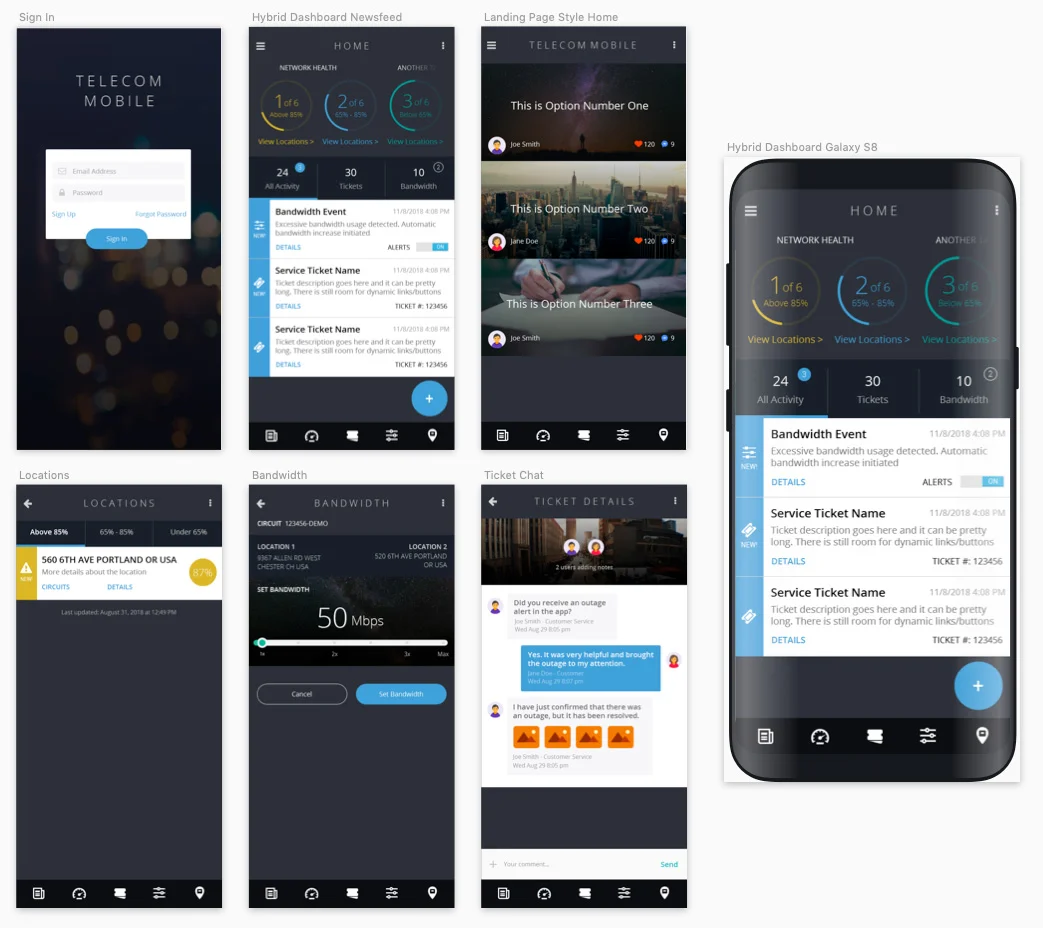
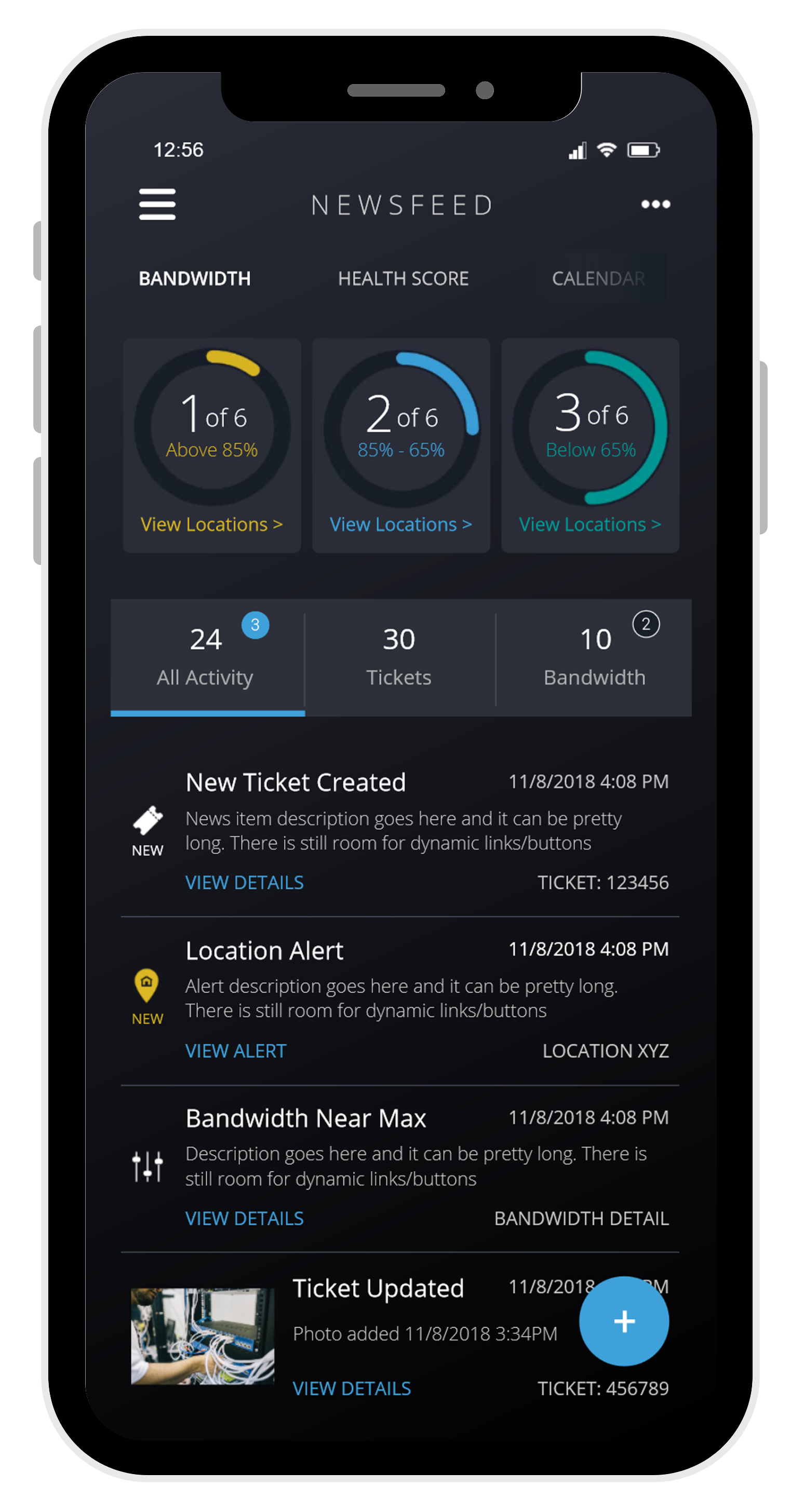
A six-month deep dive into AI-driven UX design and development. I vibe-coded this website using Google AI Studio, and refined the code in VS Code + Copilot. I prototyped BrowserFence in 13 days using Figma Make. I pushed Adobe Firefly and Google’s Nano Banana AI image gen to their limits. Along the way I uncovered AI’s gaps: misattributed quotations, hallucinated code, and bad advice. I then built repeatable workflows (markdown context files, design tokens, QA steps) that balanced AI speed with human precision.

Gen AI Front-End Dev AI Workflows
25+ COMPONENTS BUILT
98 PAGESPEED SCORE
Gen AI Summaries Project Mockup