Designing the Future of Remote Work: Parallels Browser Isolation & DaaS
Part I: Parallels Browser Isolation
I served as the lead product designer for two major Parallels product initiatives: Parallels Browser Isolation and Parallels DaaS. I worked alongside the strategic direction of the UX team leader. Each product team at Parallels operated in a truly lean way: one designer per team, full accountability, minimal overhead. A huge win for me: That’s where I thrive.
I was responsible for shaping the end-to-end UX: flows, systems, design language, implementation support. I also modernized the design system using PrimeVue and PrimeOne Figma as a baseline, reworking both aesthetics and code alignment to match Parallels’ evolving visual identity.
Goals:
- Make secure workflows feel simple and frictionless, even for non-technical users.
- Create scalable, brand-aligned design patterns that could be reused across multiple platforms.
- Minimize admin overhead and cognitive load through smart defaults, clear UI hierarchy, and task-focused flows.
The Challenge
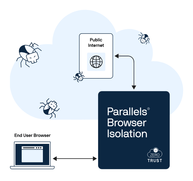
In a post-pandemic remote work landscape, Parallels needed to rapidly launch two secure, cloud-native platforms. A secure browsing tool that streams isolated web sessions to the user’s device, and a desktop-as-a-service platform offering seamless, policy-controlled access to cloud-hosted desktops.
While legacy UI patterns existed across Parallels’ web apps, they needed to be modernized, extended, and made consistent across platforms. My job was to elevate what worked, fix what didn’t, and ship.
BUSINESS NEED
Launch secure, enterprise-grade tools that support distributed workforces without compromising speed, control, or compliance.
USER NEED
Access secure web apps or full desktops with minimal friction, regardless of device or location. Reduce the learning curve for IT admins and end users alike.
Project Kickoff
Though I worked on the PBI and DaaS projects in parallel, this case study will focus on PBI. The project was born from high-level strategic planning to address the growing need for secure, cloud-native access tools, especially for customers in regulated industries. Leadership recognized that secure browsing and virtual desktops were now essential infrastructure.
The PBI kickoff meeting aligned the teams on MVP scope, compliance requirements, and Agile workflows. With no time for deep discovery, I jumped in early to audit existing tools and assess competitive solutions. Cross-functional teams were formed quickly. The PBI team had a PM, a few engineers, and me as the sole UX designer. The plan: start designing and shipping fast.
- 1. FROM INSIGHTS TO ACTION
Leadership, PMs, and UX identified market needs through customer conversations, input from industry experts, and internal audits.
- 2. DESIGNING THE SPRINT ENGINE
We formed a lean team, aligned on goals, and spun up Figma and Jira environments for rapid iteration.
- 3. SCALING WITH SYSTEMS THINKING
We committed to a modular, scalable design system (PrimeVue + PrimeOne Figma) from day one to serve both products with visual and functional consistency.
PROBLEM TO SOLVE
Enterprise IT teams must securely support hybrid workforces without adding complexity, cost, or degrading the browsing experience. The challenge is to design cloud-native solutions that simplify secure access to apps and desktops, streamline onboarding, and reduce risk from web-based threats and unmanaged devices, while maintaining speed and usability at scale.
Gathering Insights
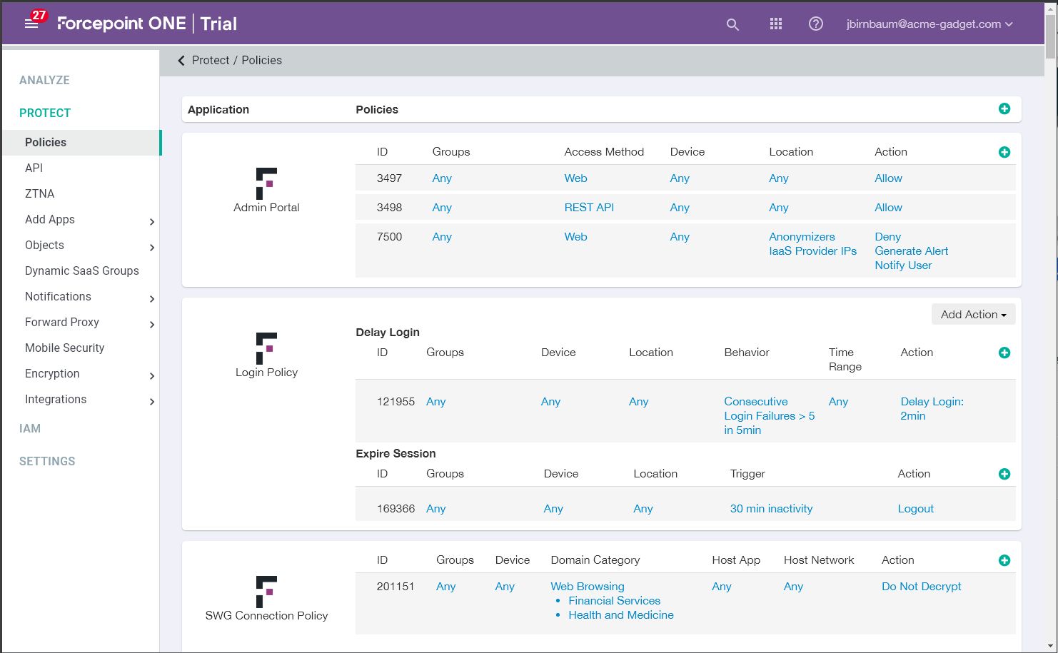
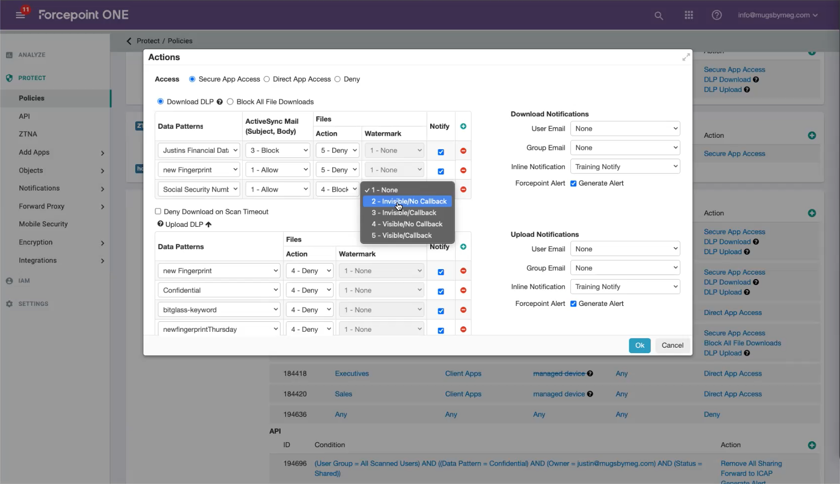
Competitive analysis of leading Remote Browser Isolation tools revealed a clear pattern: while RBI is highly effective at blocking malware and zero-day threats, most solutions struggle with latency, bandwidth consumption, and cost of deployment. Pixel-streaming approaches in particular slow browsing speeds and make enterprise-wide rollout impractical. These insights shaped our design mandate: build a solution that preserves security, performance, and usability in equal measure. Full research report (PDF)
Project Goals
SIMPLICITY OVER SECURITY JARGON
Users want secure tools that feel simple, not intimidating.
Cloudflare: Hides complexity with a clean, low-friction UX.
Cisco: Grades key features and highlights what matters most.
SETUP SPEED & TIME-TO-VALUE
Fast, effortless onboarding is a competitive advantage.
Ericom: Highlights ease of integration with existing systems.
Cloudflare & Forcepoint: Enables deployment with pre-configured templates and minimal IT lift.
POLICY GRANULARITY VS. USABILITY TRADEOFF
More control doesn't always mean a better experience.
Forcepoint: Offers deep customization, but risks overwhelming users.
Ericom: Strikes a better balance, offering templates for common use cases.
COMPETITIVE ANALYSIS
Recurring themes
These themes drove the prioritization of features and ensured alignment with Parallels' goals.
PBI must protect without slowing users down. Parallels’ expertise in low-latency virtualization ensures strong security with seamless speed.
Competing RBI tools add cost and admin overhead. Parallels’ cloud-native delivery makes deployment simple, scalable, and cost-effective.
If security feels disruptive, users bypass it. Parallels’ history of frictionless UX across devices keeps PBI usable and widely adopted.
KEY QUESTION
How can we make high-security browsing feel low-friction and familiar to users who aren't cybersecurity experts?
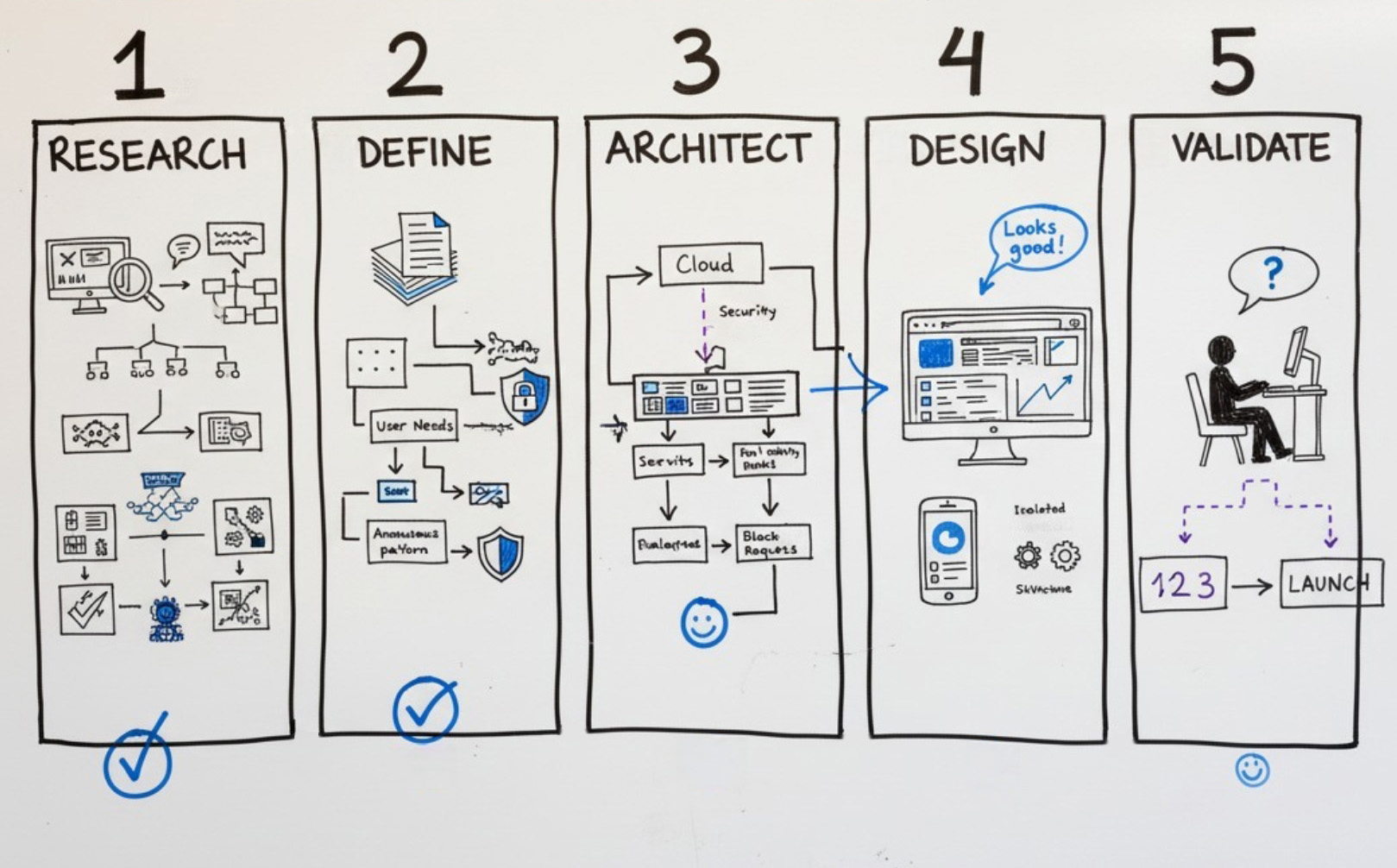
Designing in Real Time
To move fast, I designed live with the product owner, while keeping dev and QA in the loop. We iterated straight to MVP while aligning with a growing design system.
Live Working Sessions
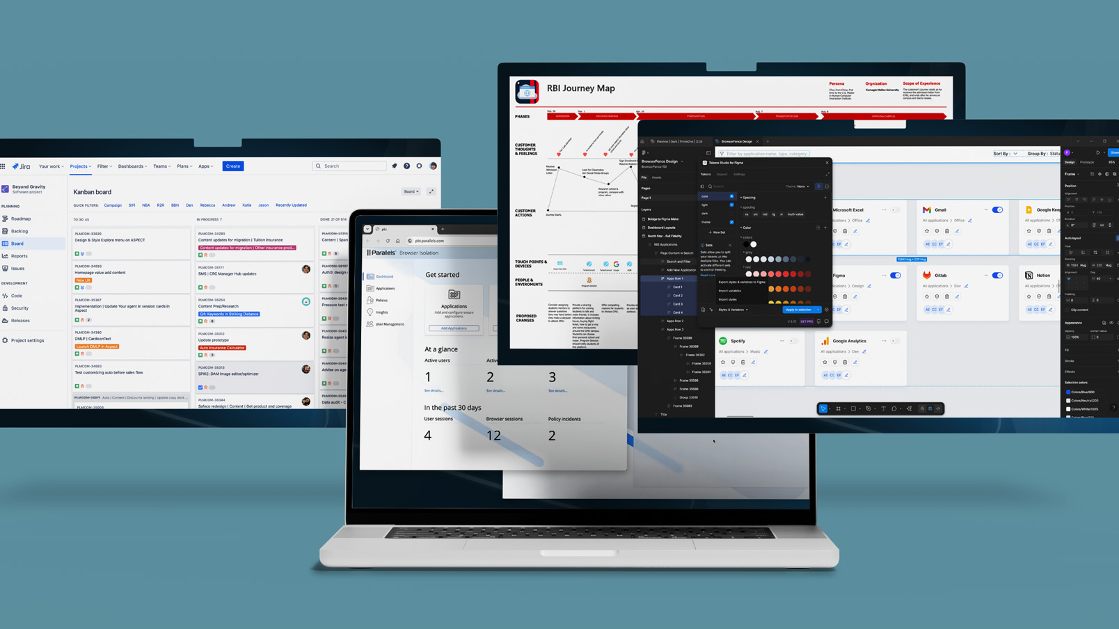
Sketch and Figma used in real-time with PM, dev, and QA to design, review, and refine features collaboratively.
Jira-Tracked Workflows
All iterations, feedback, and priorities were tracked in Jira, keeping cross-functional teams aligned sprint to sprint.
Design System Integration
Contributed to a new PrimeVue-based design system as it evolved, extending patterns where needed to support product requirements.
Iterating Toward MVP
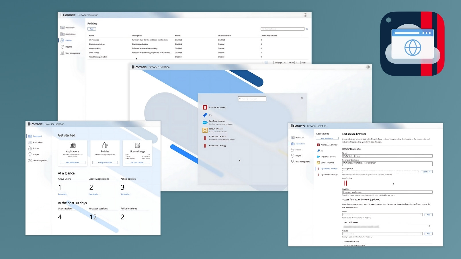
Multiple rounds of fast iteration led to a working, compliant MVP—on time and ready for onboarding enterprise users.
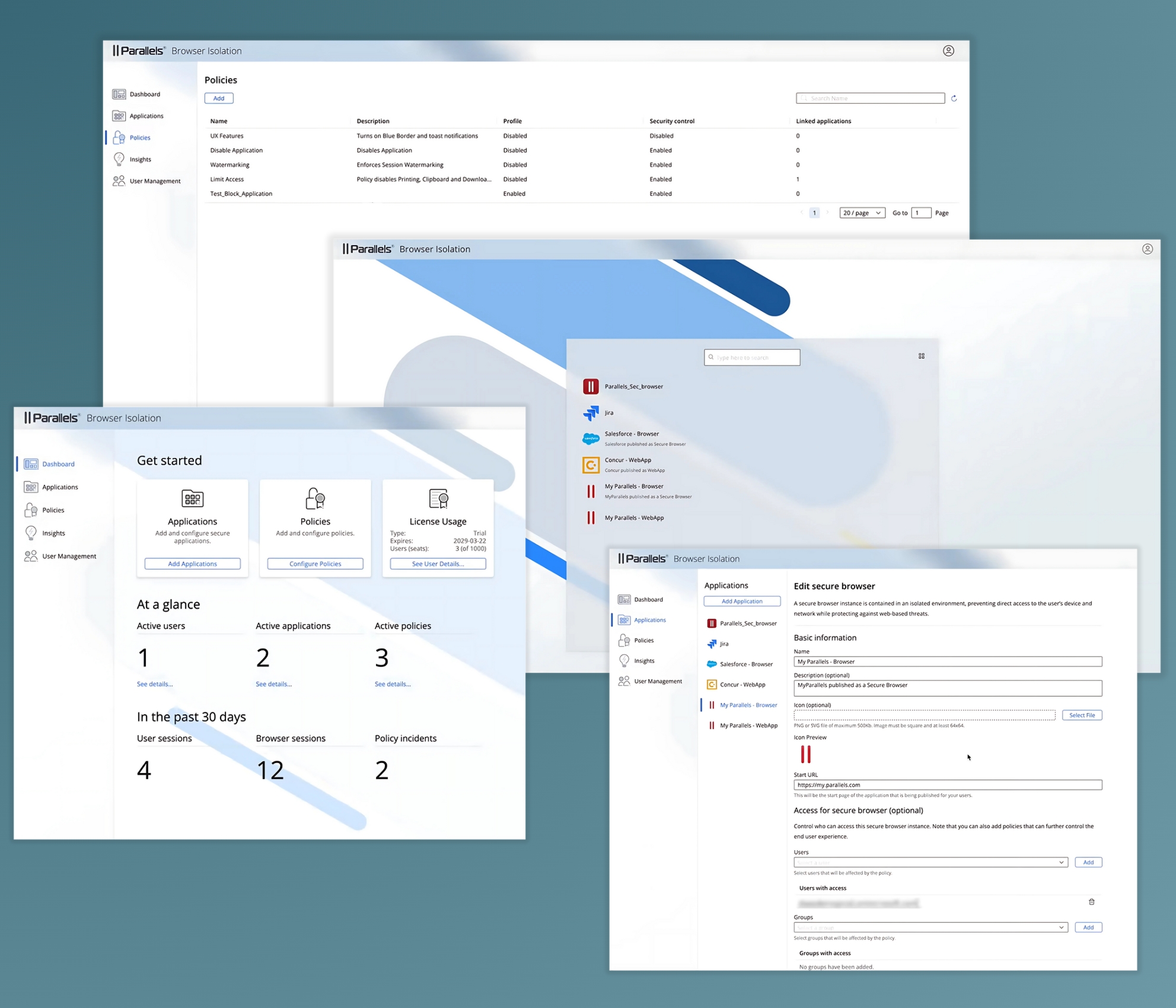
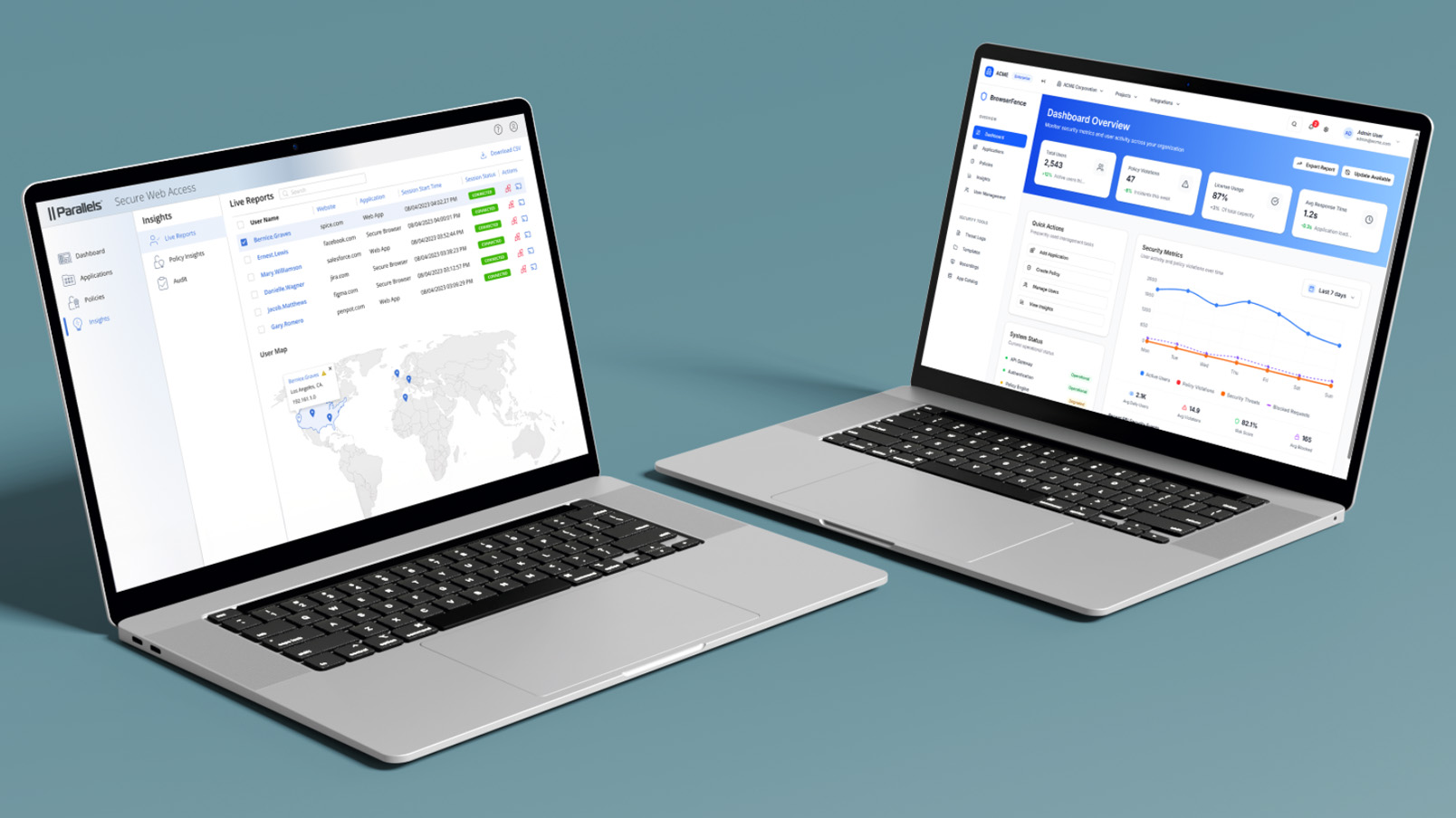
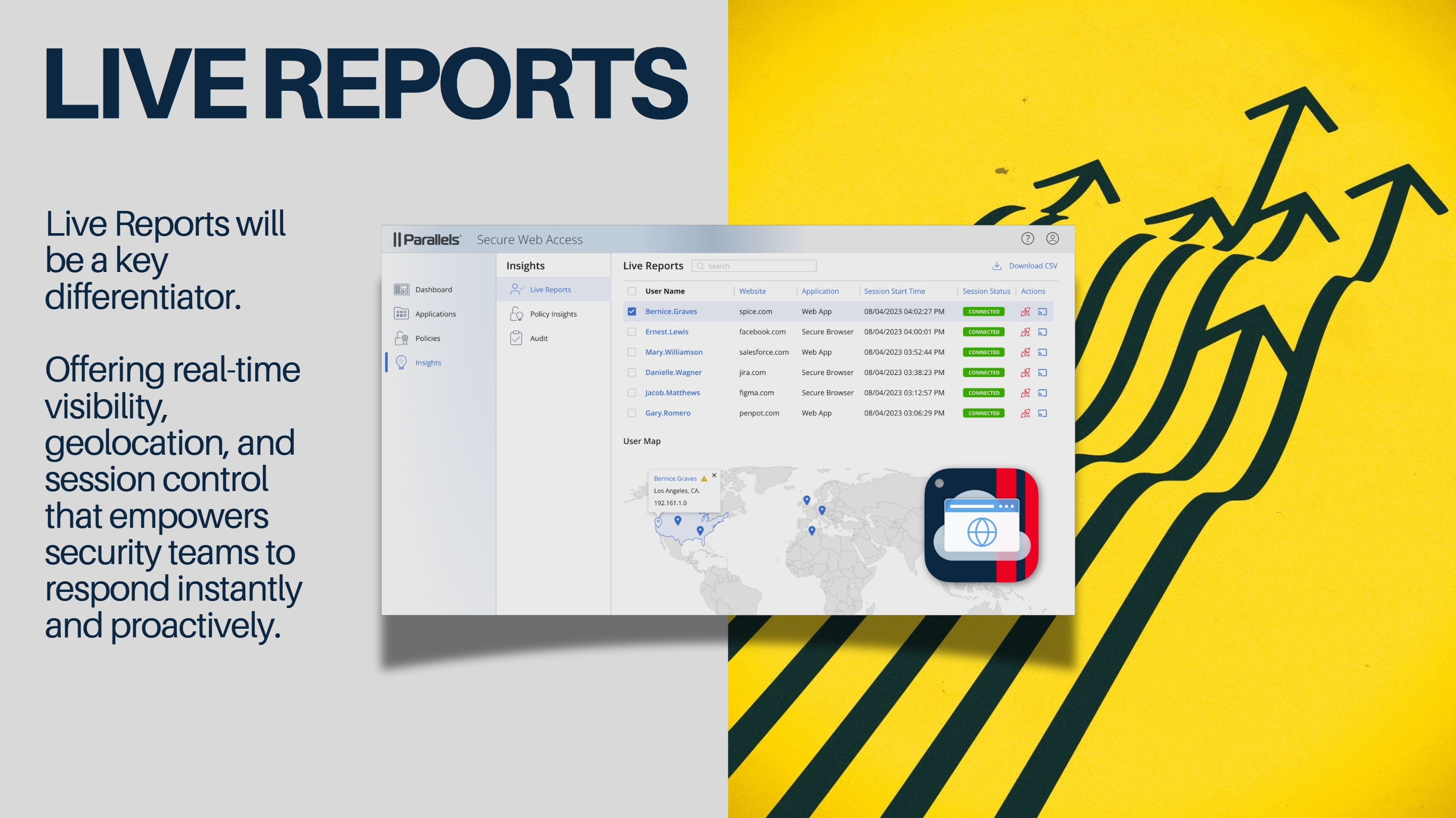
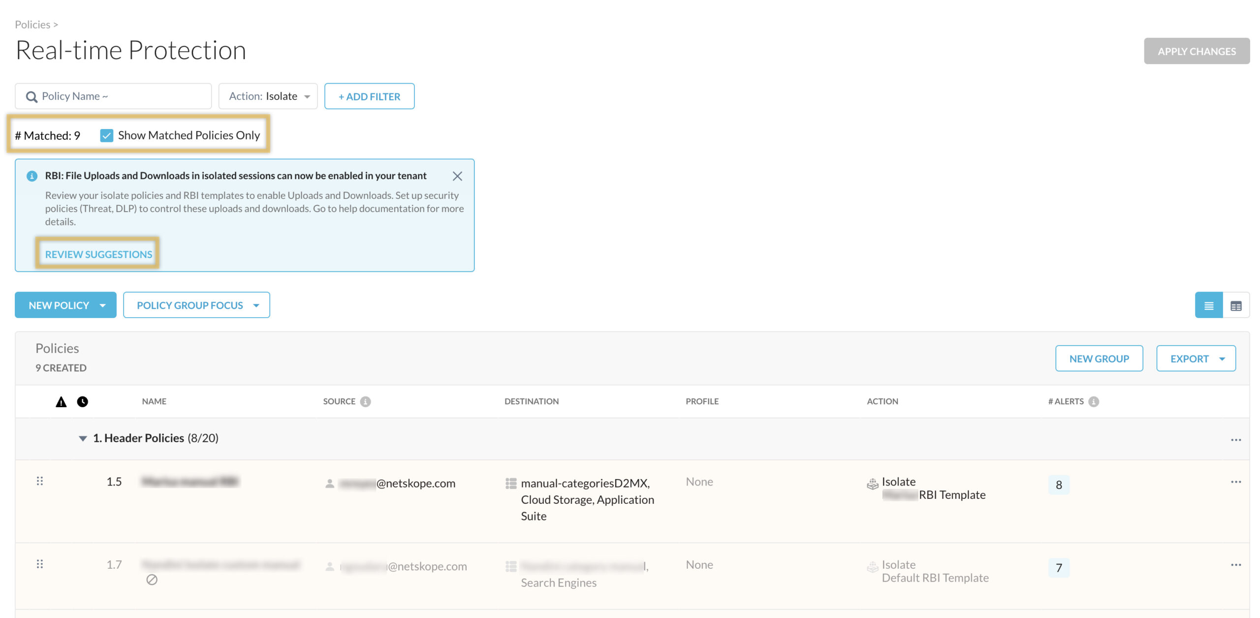
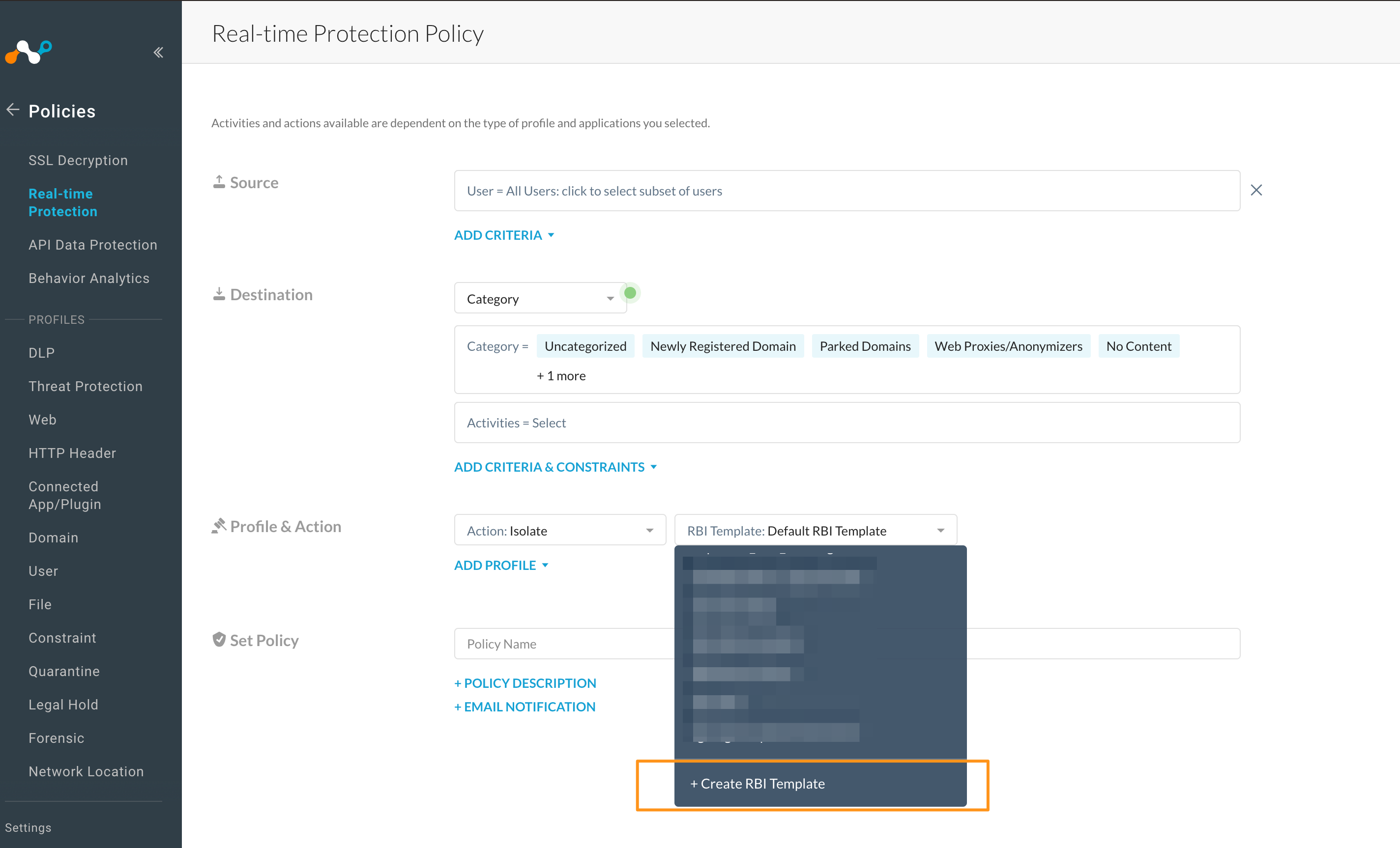
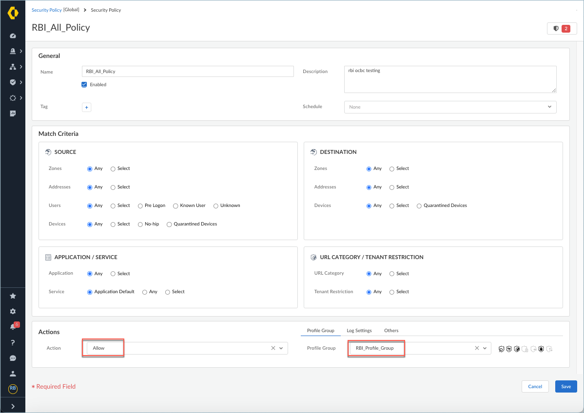
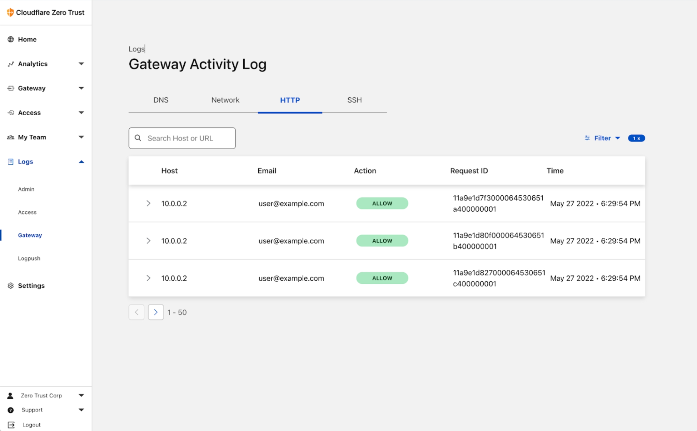
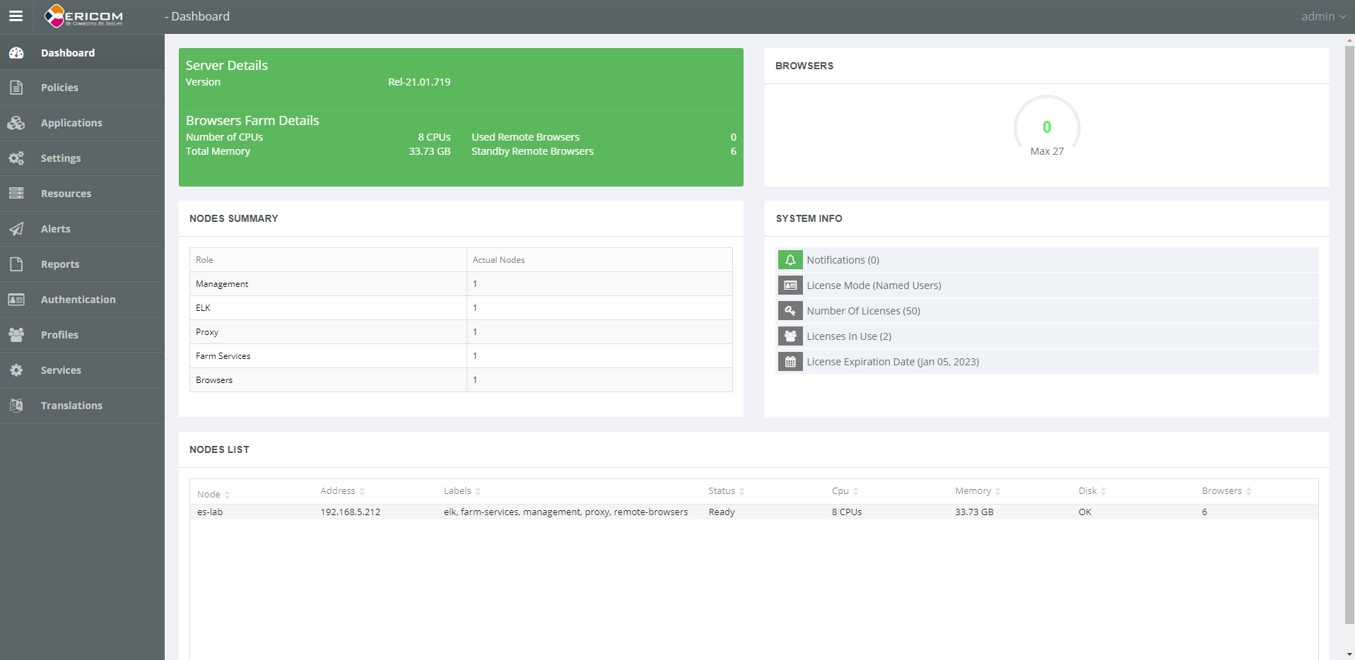
The Parallels Browser Isolation MVP product release showcased the culmination of an aggressive schedule and a large technical lift to make the product a reality.
Post-MVP Possibility
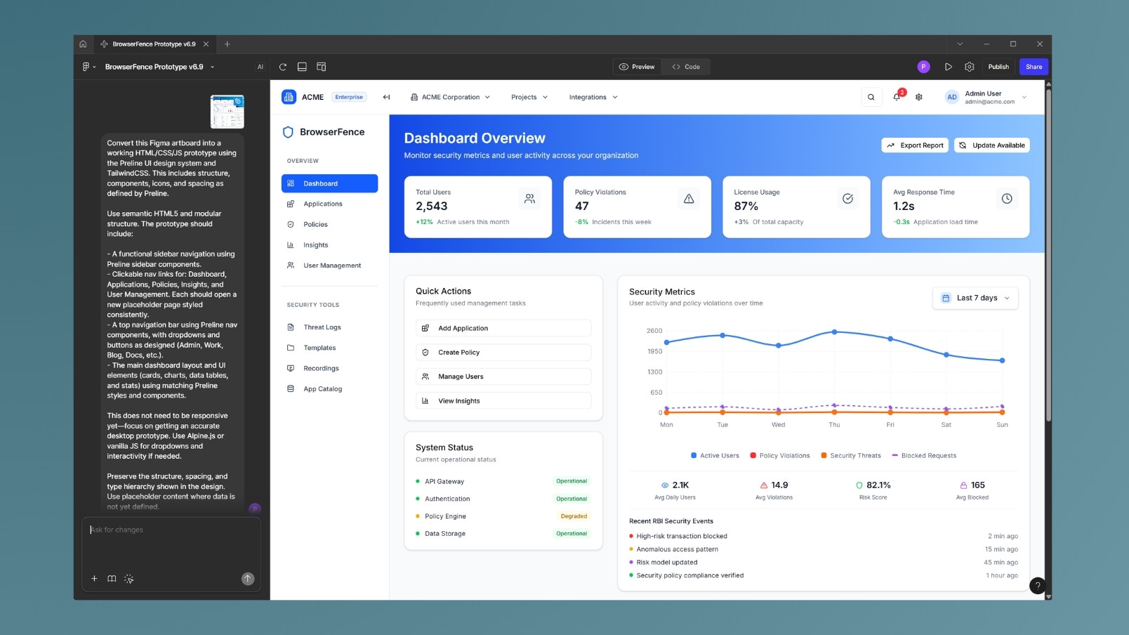
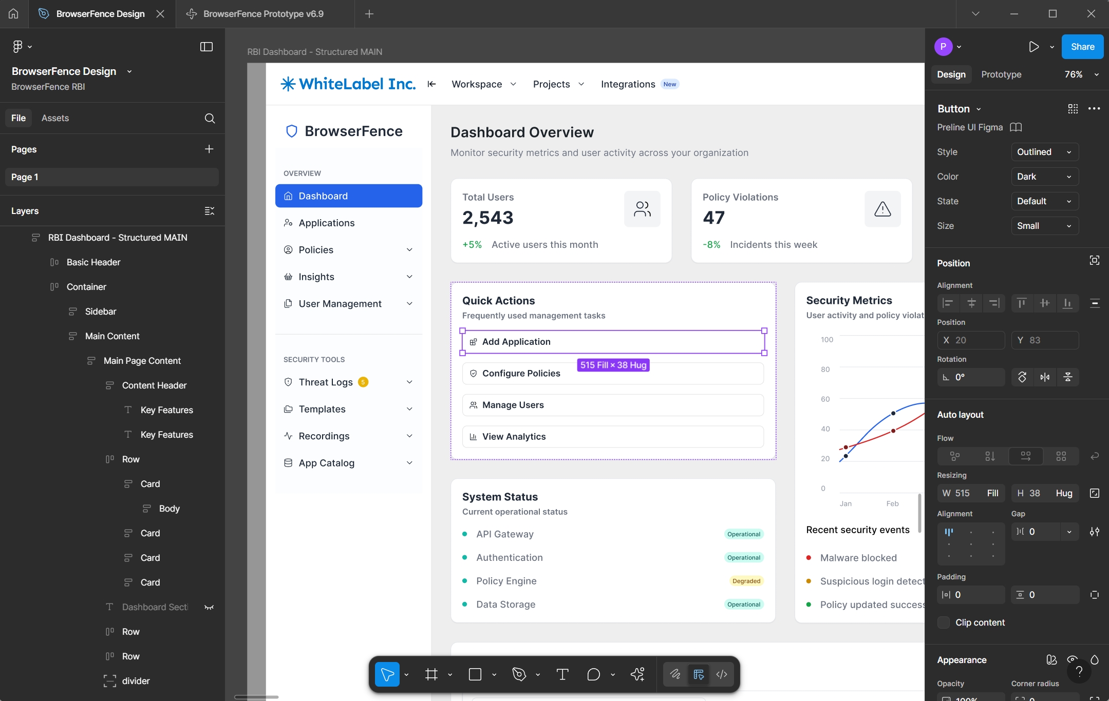
What if AI could help design the next generation of secure access tools faster than traditional processes ever could? That was the question I set out to explore after Parallels Browser Isolation. I wanted to test the limits of AI-assisted product design, not to replace human creativity, but to accelerate it. The result was BrowserFence: a fully interactive prototype built prompt-by-prompt using Figma Make, powered by real-world UX principles, industry benchmarks, and my own hands-on experience.
Part II: BrowserFence with Figma Make
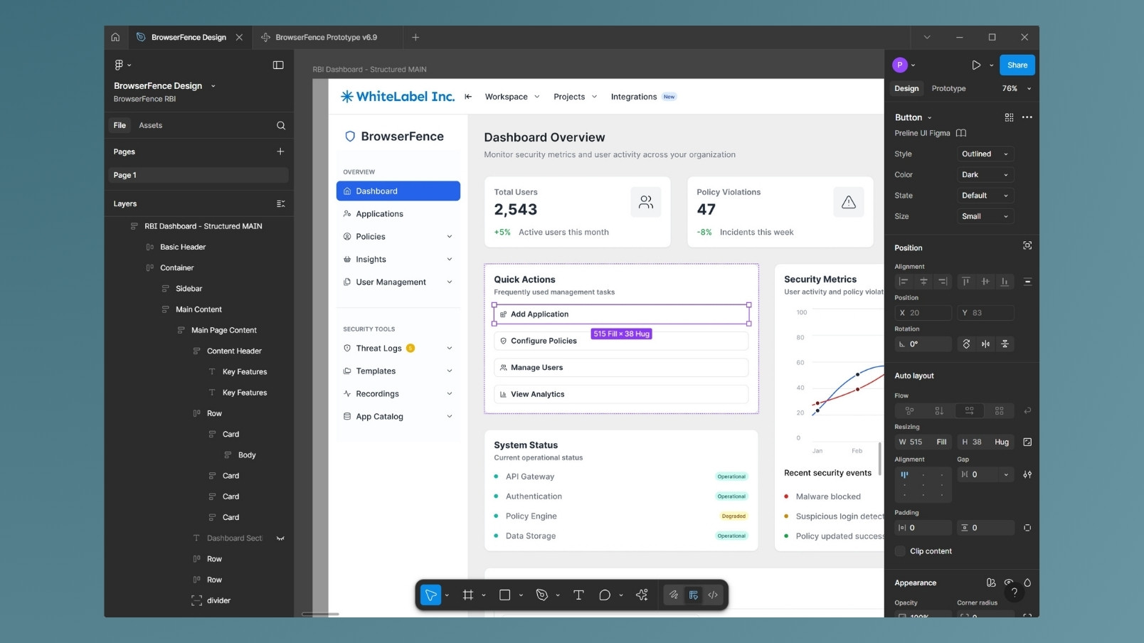
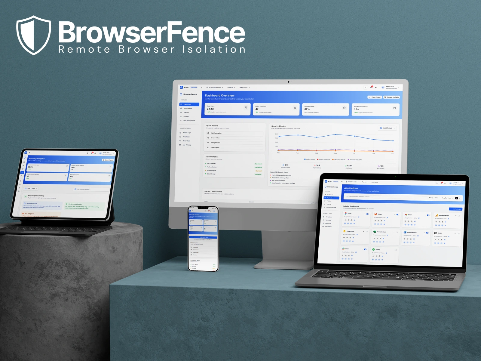
BrowserFence is a concept security platform built in Figma Make that reimagines how enterprises manage remote browser isolation (RBI). It takes a complex, high-stakes domain and makes it simple: real-time visibility, policy control, and threat defense, all surfaced in a frictionless, AI-driven dashboard.
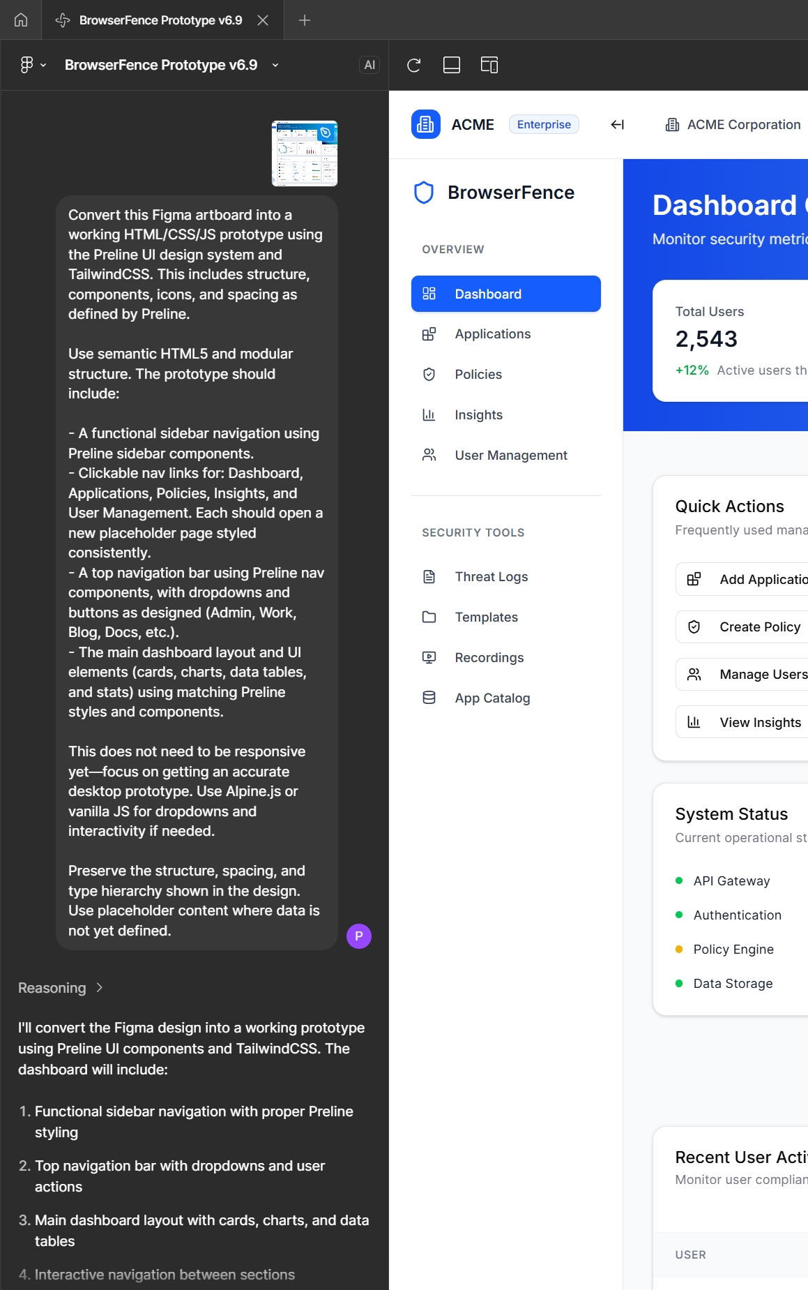
I wanted to push the limits to see what Figma Make could do, and BrowserFence is the result. I started with two (only two!) Figma artboards that were properly structured using the Preline design system, and jumped right into Figma Make.
PRELINE FIGMA DESIGN SYSTEM
Instead of rebuilding components from scratch, I structured Preline-based Figma artboards with clean layers, semantic names, and grouped logic. This mirrored the process that I used while at Parallels using the PrimeVue / PrimeOne Figma design system.
BUT... FIGMA STRUCTURE IS A TIME KILLER
Manual auto-layouts, nested frames, and naming conventions slow everything down. Instead of fighting the tool, I let Figma Make take the lead. By feeding it just two cleanly structured artboards, I unlocked a rapid, AI-assisted build pipeline, skipping hours of setup and jumping straight to production-grade output.
PRELINE + FIGMA = DESIGN SYSTEM GOODNESS
Once I established the basic design patterns with Preline, I created a high-fidelity concept to explore ideas beyond the design system.
Prompt-to-Prototype: Riding the AI Wave
Figma Make delivered an instant win: a one-shot working prototype from just two structured artboards and a strong prompt. But pushing beyond the first screen revealed the real challenge: refining and scaling an AI-built UI without losing context or breaking what already worked. What started as prompting quickly became systems thinking.
- 1. FAST START, FRAGILE STACK
The initial AI output was impressive — styled, interactive, and usable. But deeper refinements triggered regressions. Fixing one component often broke five others, and re-prompting rarely respected layout intent or naming conventions.
- 2. SOURCE OF TRUTH REQUIRED
To keep momentum, I shifted to structured prompting with markdown-based requirements. Each section had its own file — maintaining clarity, consistency, and hierarchy. It became a living blueprint that made prompts smarter and progress measurable.
- 3. HUMAN-FIRST, AI-SECOND = THE WAY FORWARD
Every layout, interaction, and flow was created through AI prompting, not manual design. This approach accelerated iteration, reduced UI debt, and proved that generative tools can deliver enterprise-grade UX at startup speed.
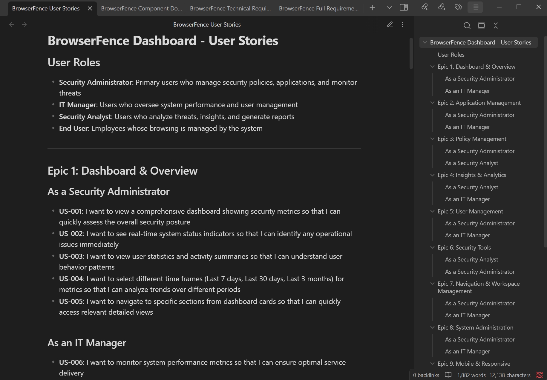
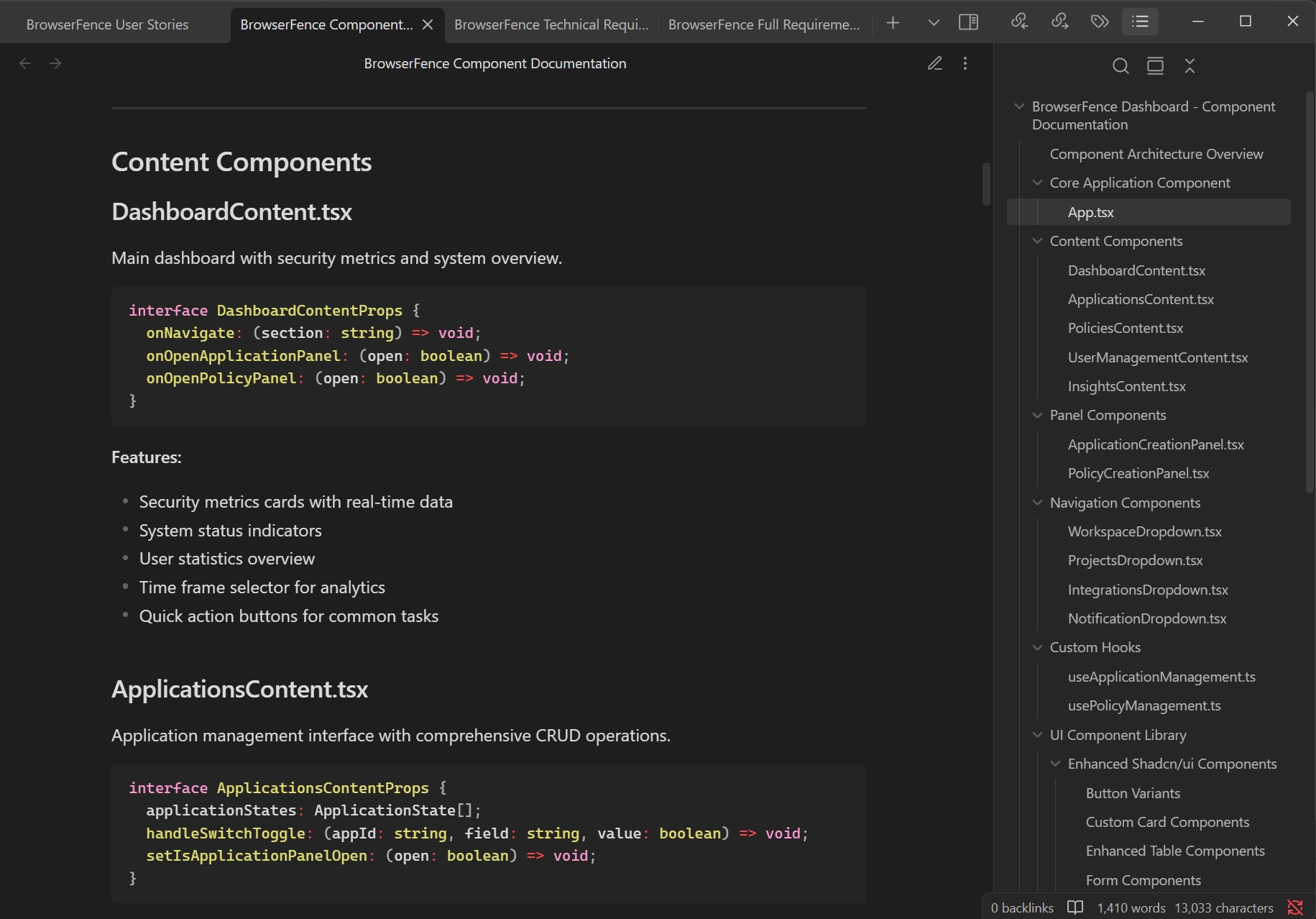
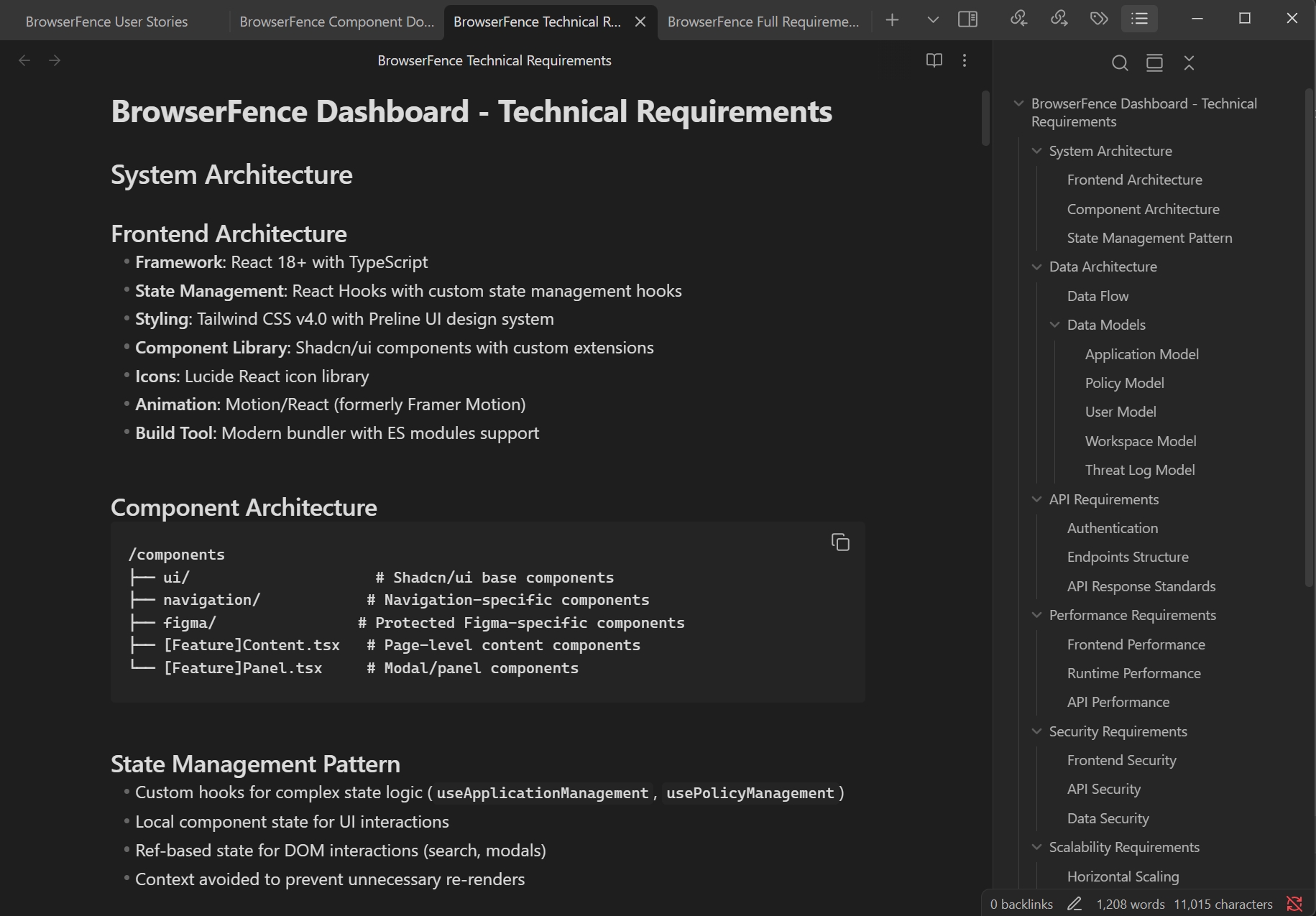
Figma Make also created full documentation in markdown format (shown here in Obsidian)
Full requirements prompt-generated from Figma Make
The Parallels Browser Isolation MVP product release showcased the culmination of an aggressive schedule and a large technical lift to make the product a reality.
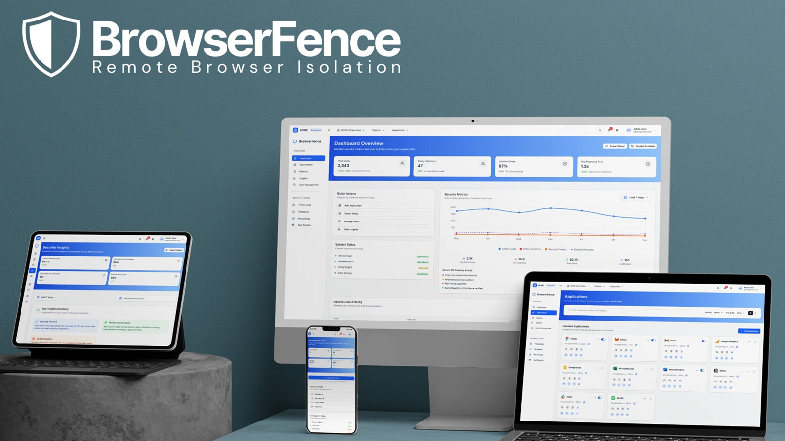
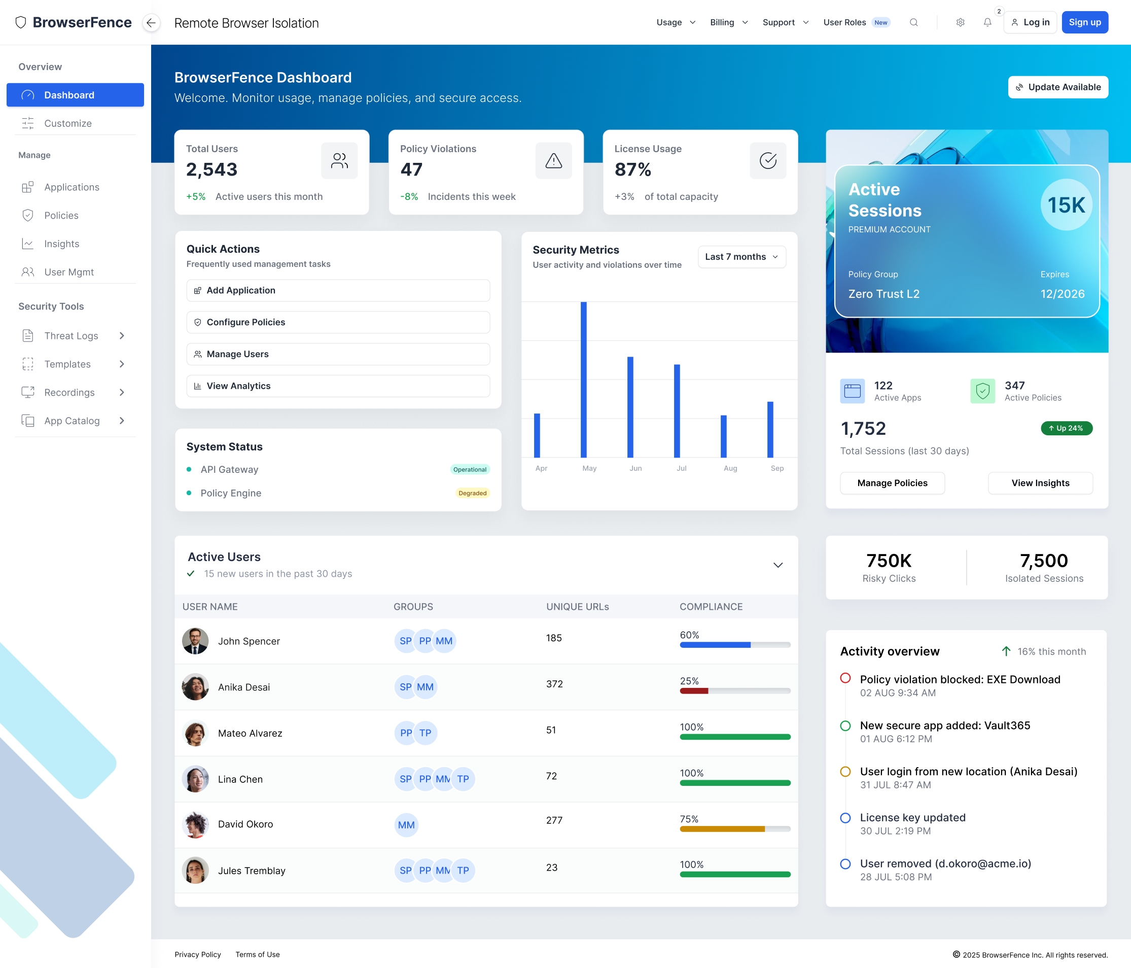
Fully responsive interactive prototype built 100% with Figma Make
Grounded Execution. Future-Ready Vision.
From MVP delivery at Parallels to AI-first innovation with BrowserFence, this journey shows how thoughtful UX can ship quickly and shape what could be possible in the future. This project was a lesson in fast execution under pressure, and visionary thinking when the limits are lifted.
+3.2x
AI DESIGN ITERATION SPEED
60%
ONBOARDING FRICTION REDUCTION
-80%
VISUAL QA REDUCTION
30+
INTERACTIVE SCREENS
What I learned from this project
Gen AI unlocks endless possibilities
I saw firsthand how AI can multiply velocity without compromising UX quality. With the right structure and prompts, it became a design force multiplier — not a replacement.
Trust grows through clarity
Complex tech needs to feel simple. By translating enterprise security into a frictionless UI, I learned how clear patterns, real feedback loops, and visual calm build trust in high-risk environments.
The brief is just the beginning
PBI proved I can deliver under pressure. BrowserFence showed I can take that foundation further — pushing past constraints to imagine what next-gen UX can really look like, using modern tools like Figma Make.